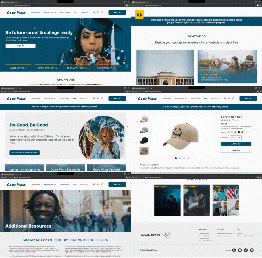
Good Vibes
Reducing college debt and stress through financial aid assistance.
Role
UX Designer
Tools
Figma
UserTesting.com
Timeline
6 months
Overview
Navigating the college application process and understanding what financial aid options are available can be overwhelming and time-consuming, and many students leave college with substantial debt. Additionally, there are also many different avenues through which students can begin applying to colleges. Having so many places to apply can be hard to track and can be de-motivating. Rather than outsourcing to various college websites, Good Vibes provides one place where students can find tools and mentorship to assist them in applying to colleges and minimizing debt.
Problem
Users feel overwhelmed by the college application process and worry about going into debt. They also aren’t sure what services are available. Users want to be able to understand how to get financial aid and receive help on their college applications in one place.
Solution
To reduce users feeling overwhelmed and provide them one place to quickly get financial aid help, I redesigned Good Vibes and prioritized the following:
Design one hub stop for college resources.
Use hierarchy and clear text so users can understand how to receive help.
Minimize information on page through menus and condensed search features.
Discovery
Kick-Off and Client Questions
My main focus during our kick-off meeting was to further understand Good Vibes as a brand/product, as well as have a comprehensive knowledge of their mission and what impact they want to have. A previous design team had created the high-fidelity wireframes before handing them off to our team, and I was also provided the design system, user story, and original demo website for Good Vibes. I utilized these resources from the client to ensure I fully understood Good Vibes' vision in order to create consistency in future designs and iterations moving forwards.
User Stories
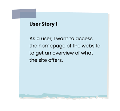
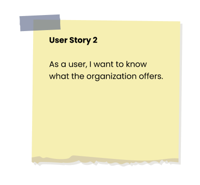
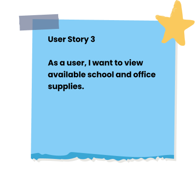
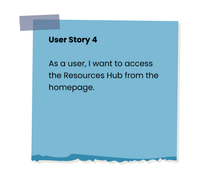
During Discovery, the client provided the team with the following user stories. Understanding these user stories helped me in empathizing and considering how a user might interact with each page to make an accurate prototype, as well as helped to guide the team on what areas of the redesign we might focus on. For the scope of this project, I led the redesign of the shop page, user story 3.
Test
Prototyping
Once I had a clear understanding of the user stories and user flows, I used the high-fidelity screens provided by another design team to create an interactive prototype. My specific focus was connecting the flows for the shop page. This prototype allowed users to interact with the product so that the team could identify usability issues.
Usability Testing Plan
Using UserTesting.com, unmoderated user testing was completed to assess the usability and flow of the current design and features of Good Vibes using a prototype. Fifteen users were recruited through usertesting.com and came from various age groups and backgrounds. Users were provided with the prompt to imagine they are a high school senior beginning to apply to college
During testing, users were asked to complete the following tasks:
You want to see what Good Vibes offers. Look at the homepage to see what they offer.
You’re curious about the Resource hub. Review what resources and scholarships/grants are available.
You want to know the range of services Good Vibes provides. Find what they offer.
You are interested in purchasing a Good Vibes University hat to sport around your new campus. Find a new hat to buy.
Findings
Once usability testing was complete, I collaborated with my team by using affinity mapping to find patterns in our data and prioritize issues based on user impact.
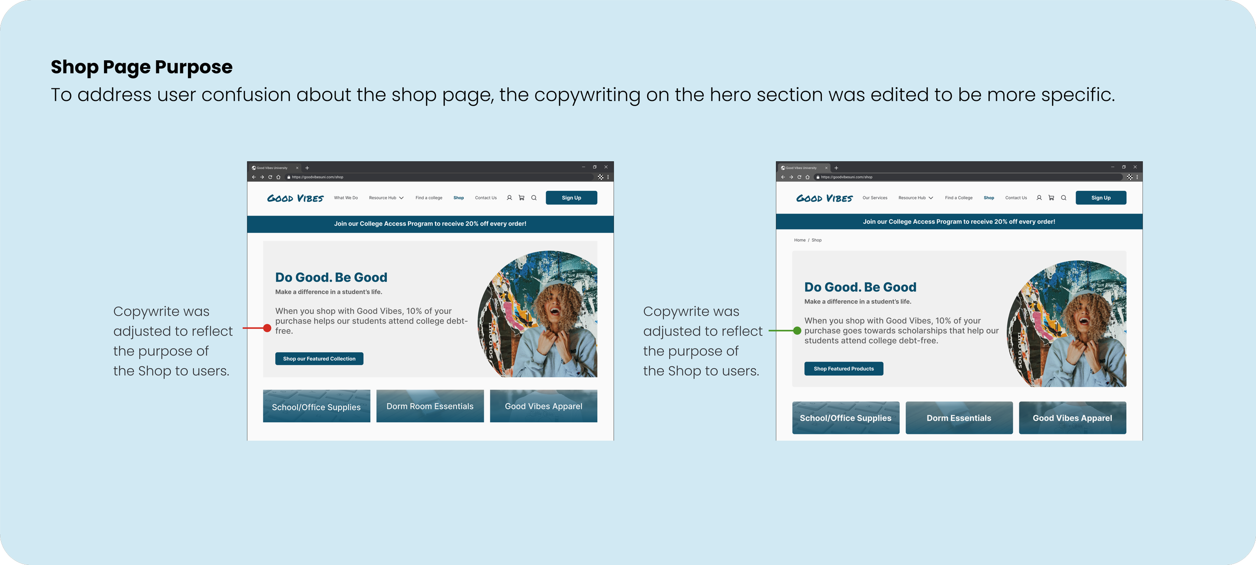
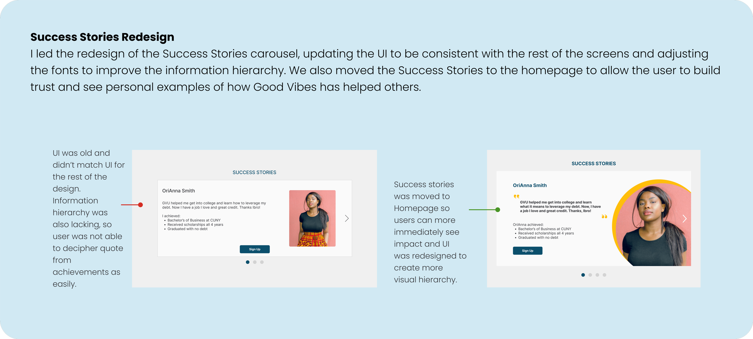
Using the common pain points and experiences, the team pinpointed key issues and made the following recommendations for improvement:
Design
Redesign
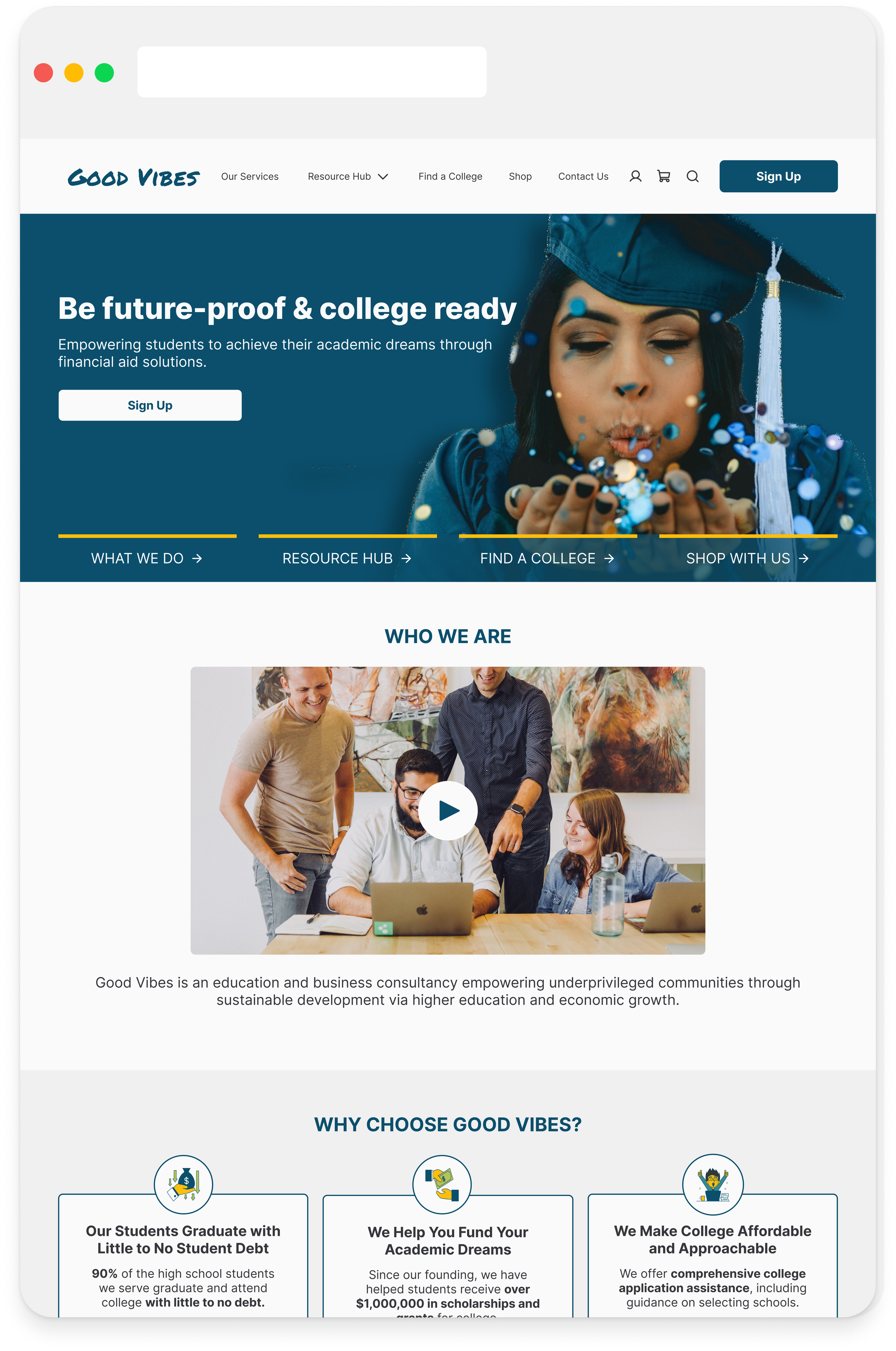
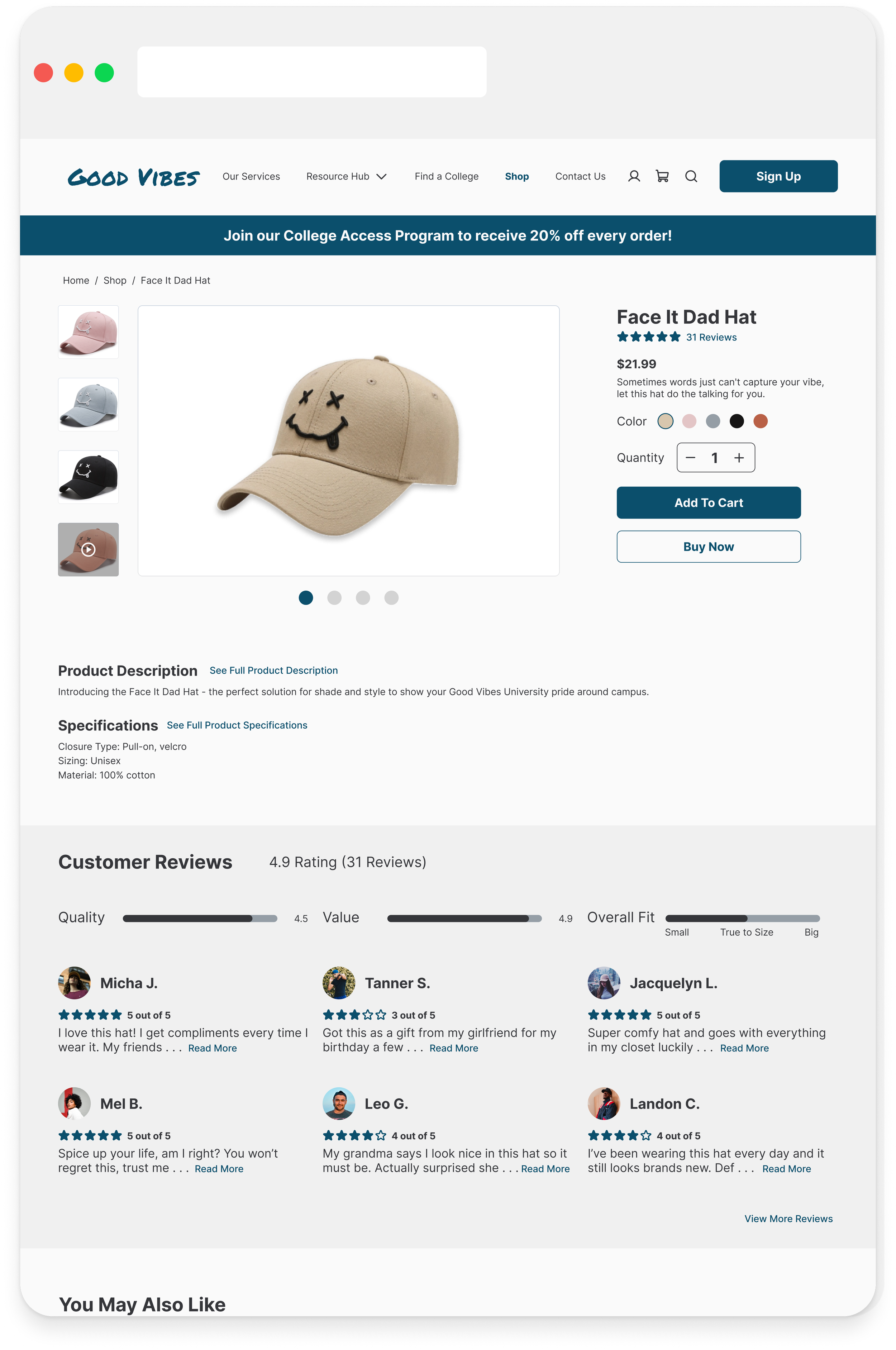
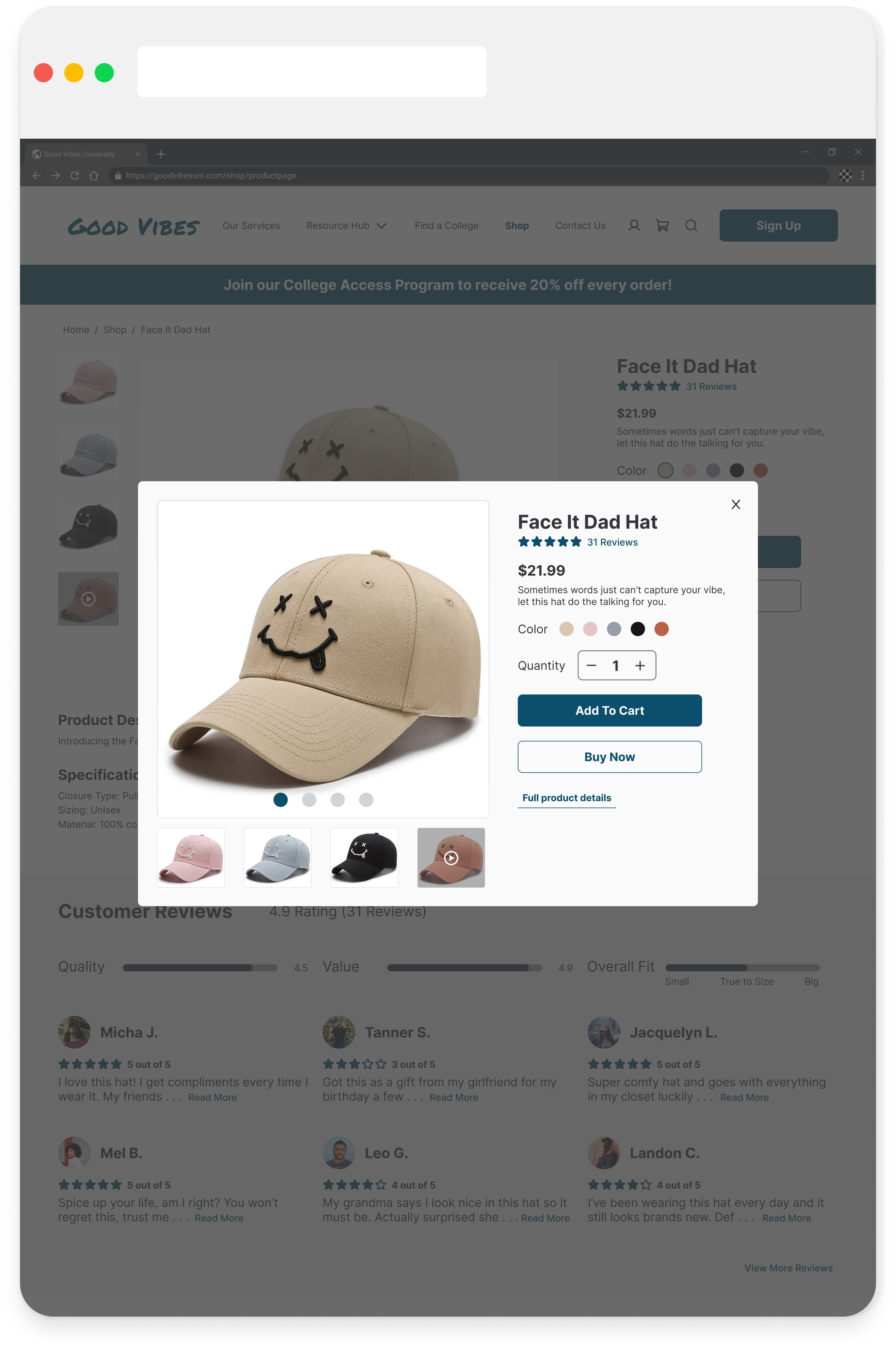
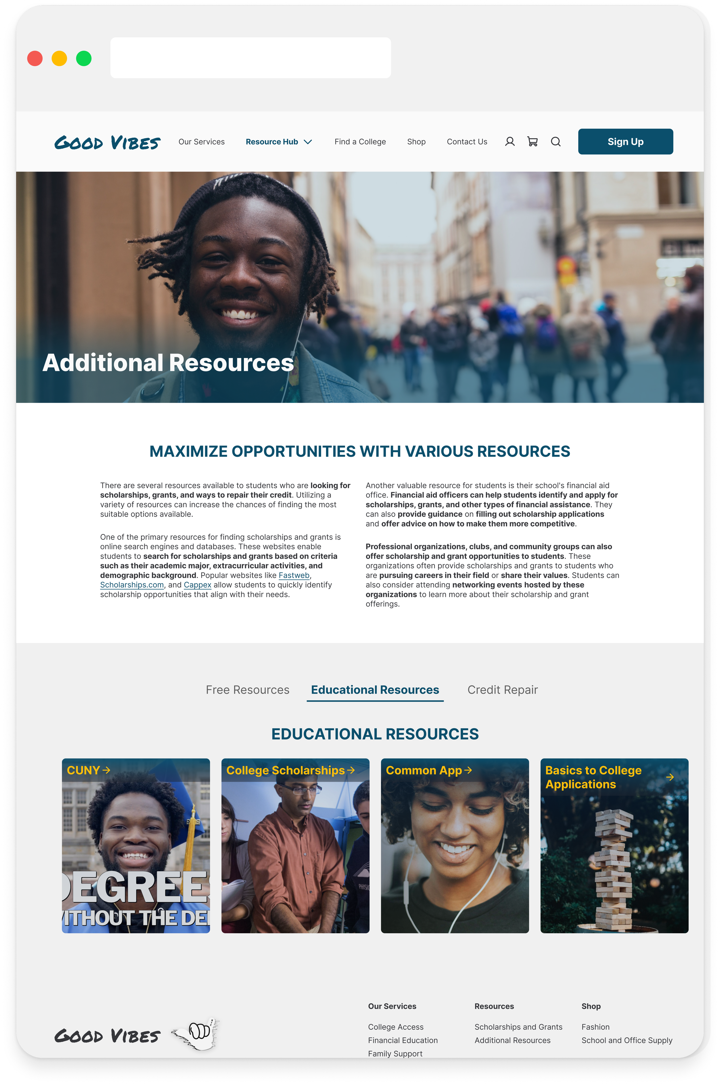
Now it was time to start implementing those recommendations. For the redesign, I led the efforts in updating the Shop page and the testimonials section. While redesigning, I prioritized information hierarchy, descriptive copywriting, and minimizing the mental load on users when finding the financial aid information they needed quickly. Throughout this process, I also continually assessed other similar shopping websites and competitors to follow best practices and industry standards that would be familiar to the user.



Developer Handoff
Annotations and Measurements
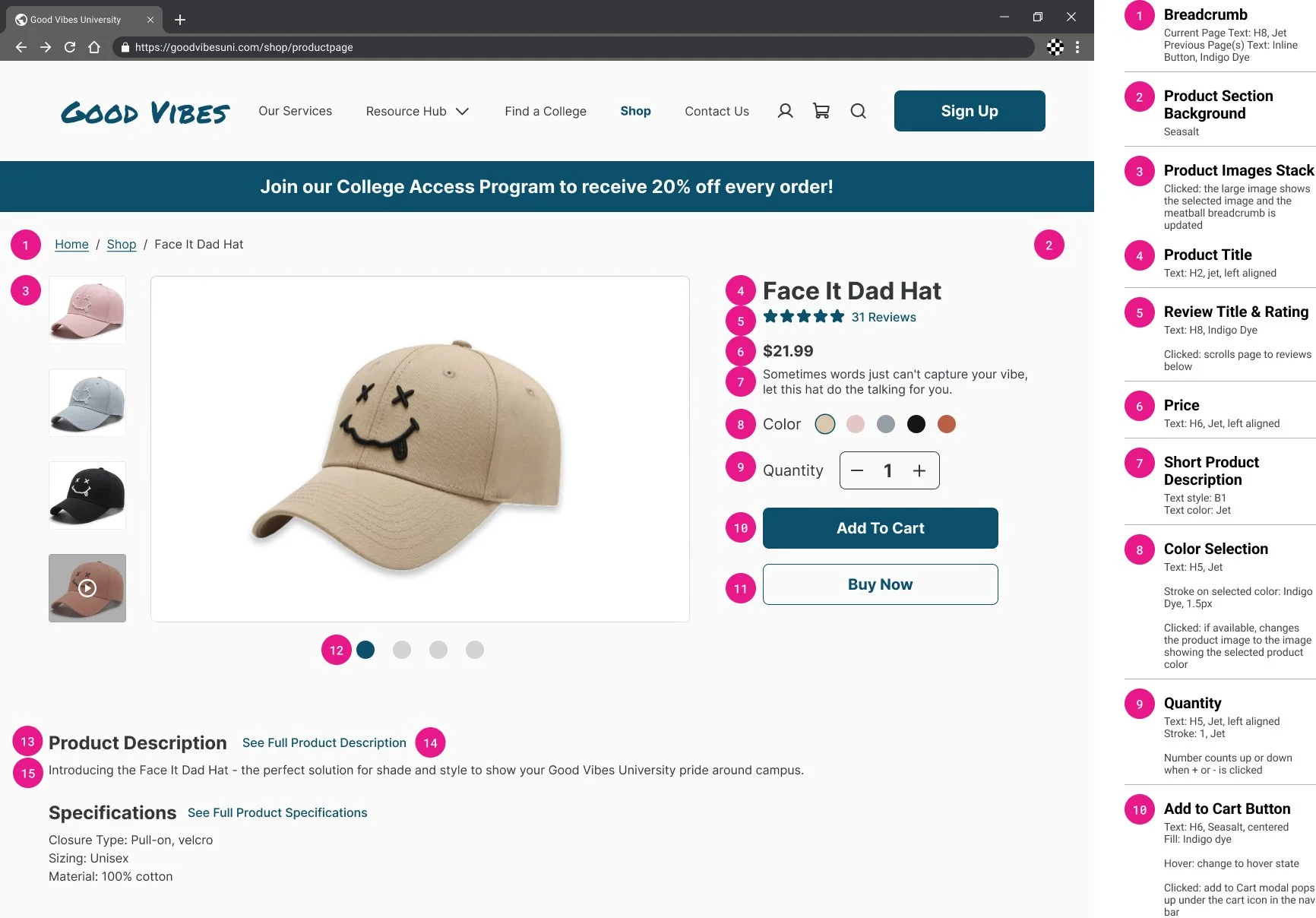
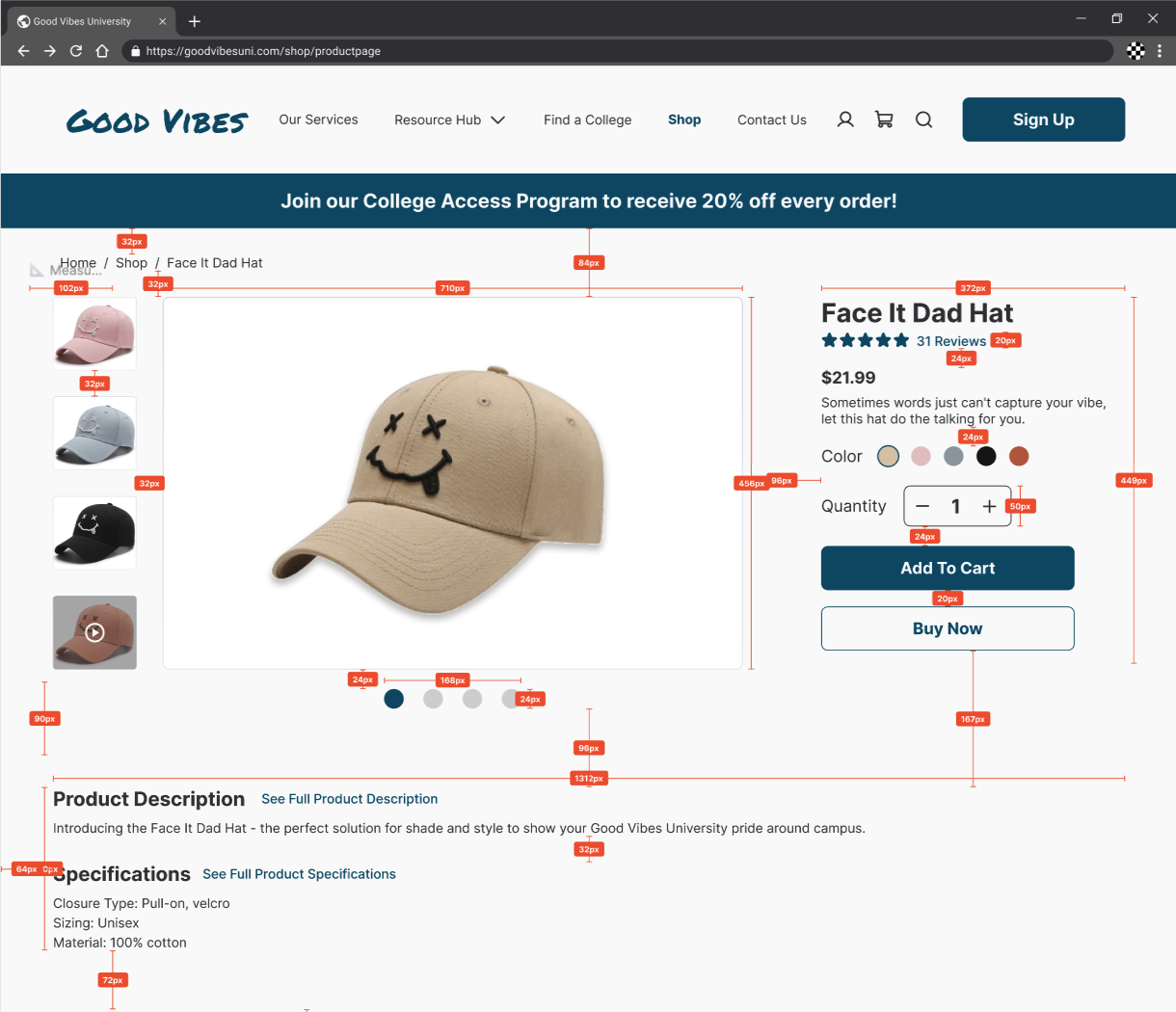
Once iterations of our redesign were complete, we updated the existing design system/components and prepared for developer handoff. For dev handoff, I assisted with preparing the shop user flow where I focused on providing measurements and annotations. While annotating, I made sure to communicate text and color styles, as well as interactions and intentions behind buttons, text fields, or other interactive components of the flows. This will allow for a smooth transition to the next team, as well as help developers create these pages accurately and efficiently.
Reflections & Next Steps
Reflection
Auto Layout is Your Best Friend
Auto layout is a tool that I've found is a necessity in my designer tool belt. In this project, we collaborated a lot and made sure the whole team was utilizing auto layout to help our designs have consistent spacing and to make it easy for future edits and changes to be made. Working on this project additionally helped me to use auto layout to make sure our designs and screens are responsive, which made it efficient and consistent when adjusting to various screen sizes and devices. I will definitely continue to integrate auto layout throughout the design process!
Small changes make all the difference!
During our first rounds of user testing, we found that many users reported minimal pain points and overall interacted well with the current interface. While this was validating to the redesign, we were initially unsure if we would be able to identify usability issues. However, as we delved deeper and further analyzed our testing, we found that users were overall satisfied with the product redesign but that there were small interactions that lead to frustration, such as larger blocks of text, copywriting being unclear, and buttons that weren't interactive. Though small, users reported that these changes would increase their satisfaction with the product. This was a helpful reminder that redesigns don't always have to be major and that often it's the small details and interactions that elevate a product to make it usable and useful to users. Moving forwards, I'll continue to remind myself in my design process, as sometimes it can be easy to get caught up in the broader picture and major interactions of a user flow.
Next Steps
The specific scope of this project included redesigning the home page, resources pages, and shop page. As we completed our usability testing, many of my users were curious about other features, such as the college search and financial mentors, as well as mentioning additional features that might be useful to add, such as a finance calculator. Moving forwards, Good Vibes could continue to build out these features and complete additional user testing to expand their resources to further help their users be debt-free in college.
Thank you for learning about my design process for Good Vibes!
Interested in seeing more or getting in contact? Use the links below to check out my other projects or get in touch!
