Circle
Creating meaningful connections for any circle of friends from anywhere in the world.
Role
UX Designer
UX Researcher
UI/Visual Designer
Tools
Figma
Zoom
Miro
Google Forms
Timeline
4 months
Overview
As adults, it can be hard to find the time and energy to connect with friends who live both near and far in meaningful ways. Oftentimes, the demands of work and day-to-day life can make it hard to feel caught up with friends’ lives. In order to address this challenge, I researched, developed, and designed the Circle app, which aims to create authentic and meaningful connections for every close circle of friends from anywhere in the world.
Problem
Connecting with friends as an adult can be challenging when friends are oftentimes busy. Additionally, many friends have moved to different parts of the world with remote work becoming common, and current social media platforms can feel impersonal and are directed towards a larger, more general audience. Thus, many people feel disconnected from their friends and may not have a quick, easy way to feel connected.
Solution
The Circle app aims to help maintain friendships and help close friends feel connected to one another by:
Making it easy and quick to respond to a communication from friends and remember to respond
Making it easy to schedule face-to-face interactions with friends
Making texting/messaging feel more personal and capturing people’s tones/emotions
Creating low-effort opportunities for friends to share life updates
Discovery
Secondary Research
To start off this project, I wanted to understand people’s experience with friendship to identify key problems users are going through. I started by researching online articles and news sources and found:
As people get older, close friendships change and often become more transient and contact becomes less frequent between friends (Stylist, 2019)
50-60% of Americans report increased feelings of loneliness (Harvard Gazette, 2021), especially after the pandemic.
Many report that current social media does not help to improve or impact their existing close friendships (OPUS,2013).
Primary Research
Once I finished learning about already existing research, I did user interviews of my own to gather more insight into the current issues and barriers in maintaining adult friendships and identify how to help friends feel more connected. To kick-off my user research, I identified three research questions:
Primary Research - Surveys
In order to recruit participants for interviews to gather more information around people’s experience with friendships, I distributed a screener survey over social media and to personal connections and received 23 responses. Based on the screener survey, 5 participants were interviewed who met the following participant criteria:
Primary Research - User Interviews
These 5 users were then interviewed over Zoom to further understand the topic of maintaining adult friendships and barriers that users faced with connecting to friends. The qualitative data gathered from the interviews was then utilized to create affinity maps, empathy maps, and personas. As I interviewed, most users mentioned friends being busy, friends living far away, and lack of communication as barriers to their friendships.
Affinity Mapping
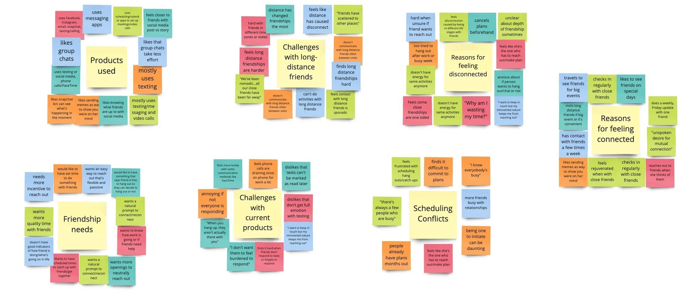
Using the interviews to find similarities in users’ experiences, I organized the data and found 7 common themes, including:
Products used
Friendship needs
Challenges with long-distance friendships
Challenges with current products
Reasons for feeling disconnected
Scheduling conflicts
Reasons for feeling connected
Identifying these themes gave me insight into what users were currently doing to connect with friends, as well as insight into common pain points that were occurring between users.
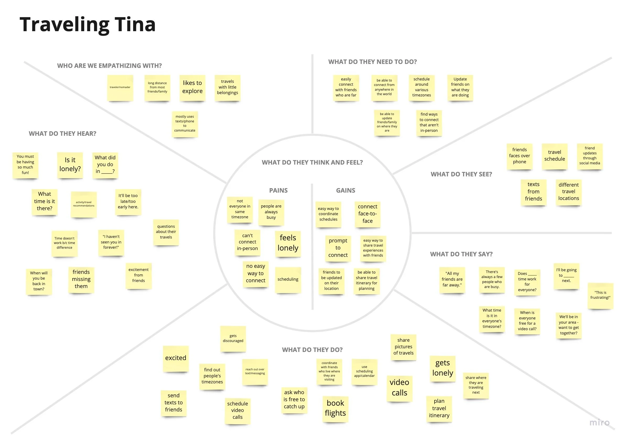
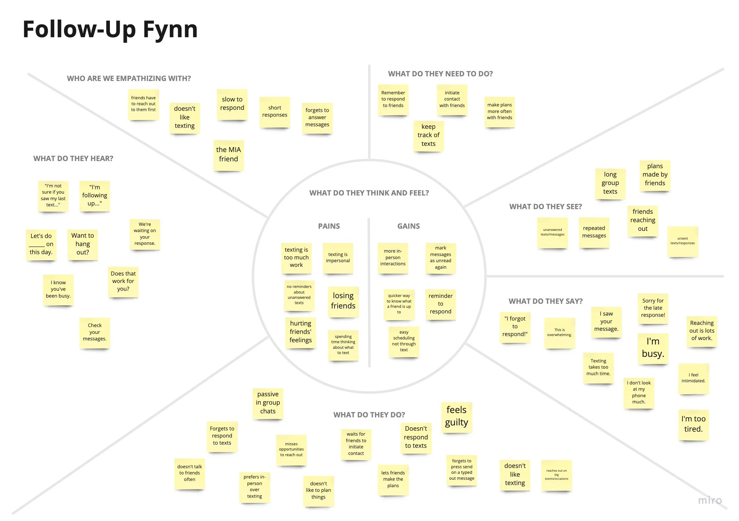
Empathy Maps
I was able to use common themes and similarities found during affinity mapping to identify 3 types of users:
The Traveler
The Follow-Up Friend
The Initiator
After creating empathy maps, I felt like I had a better understanding of the needs, thoughts, and behaviors of each user in relation to maintaining close friendships and connecting with friends and was able to start pinpointing specific pain points and problems they each faced.
Personas
After identifying my 3 users through affinity and empathy mapping, I created 3 personas to further empathize with my users and understand the different goals and pain points each might experience. With these personas in mind, I was able to start brainstorming how to help each user feel more connected to their friends:
Problem Statements
I used pain points and challenges that were identified from user interviews, affinity/empathy mapping, and personas to create How Might We statements that address challenges with maintaining adult friendships, including:
How might we make it quicker and easier to respond to communication from friends and make it easier to remember to respond?
How might we make scheduling face-to-face interactions with friends easier?
How might we make texting/messaging feel more personal and capture people’s tones/emotions?
How might we create low-effort opportunities for friends to share life updates with each other that are more frequent and in-depth?
Ideation
Brainstorming
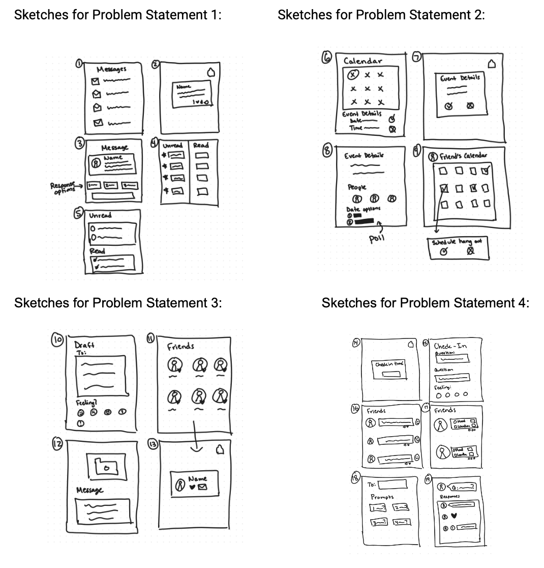
Using information gathered in the discovery phase and the established problem statements, I sketched ideas to brainstorm ways to solve user’s problems around connecting with close adult friends. Some potential solutions included:
Marking messages as unread and setting reminders
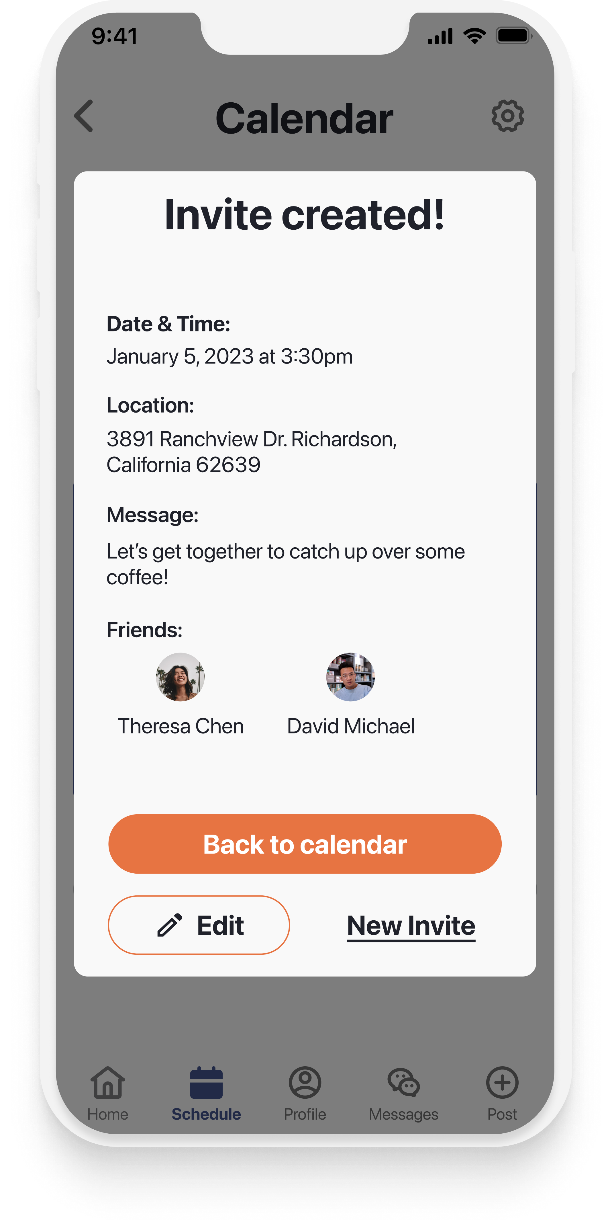
Creating events/hangouts to invite friends to
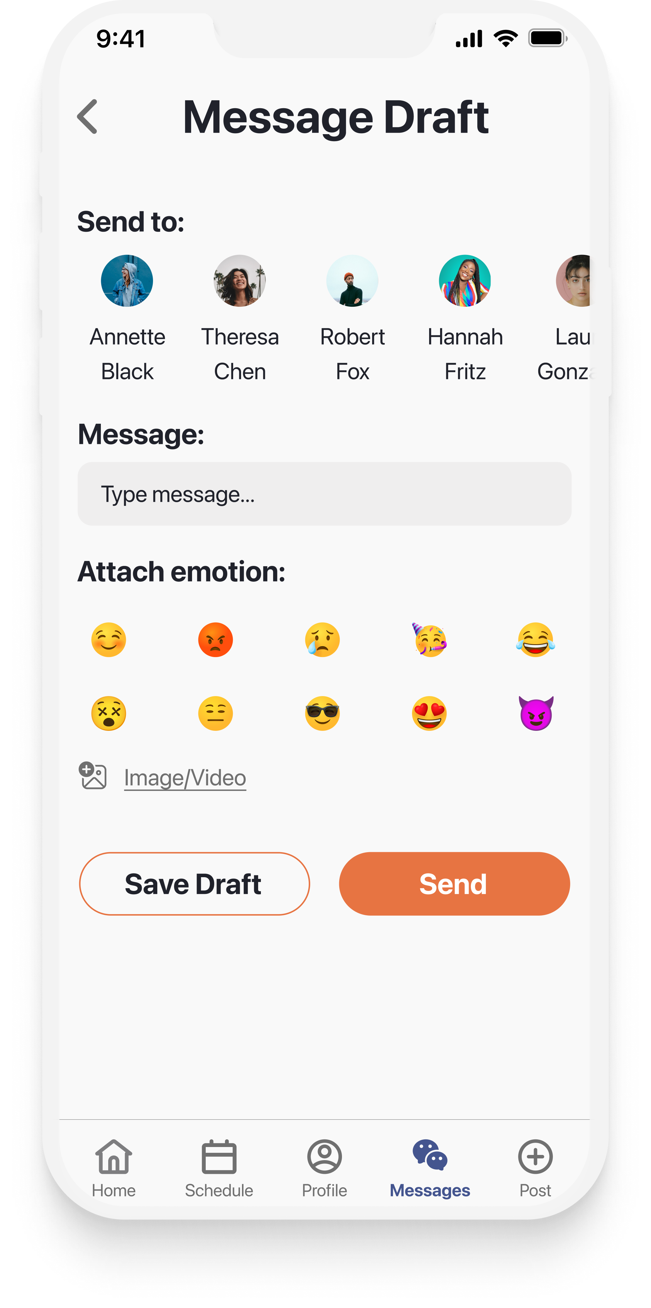
Attaching emojis to messages for context of emotion/feeling
Having a notification/scheduled time to post a check-in or update to the feed
User Stories
After brainstorming some ideas, I created initial user stories to identify what a user will accomplish when using Circle to interact with friends. The user stories were prioritized based on functionality and user needs. For the initial MVP, the following user stories were prioritized for this scope:
As a user, I want to be able to create an account so that I can have personalized access to my close friends.
As a user, I want to be able to log in with a username and password so that I can securely access my account.
As a user, I want to be able to add my close friends so that I can easily connect with them.
As a user, I want to be able to message my close friends so that I can stay in contact with them in a way that isn’t in-person.
As a user, I want to be able to organize my messages into read and unread so that I can see which messages I need to respond to.
Site Map
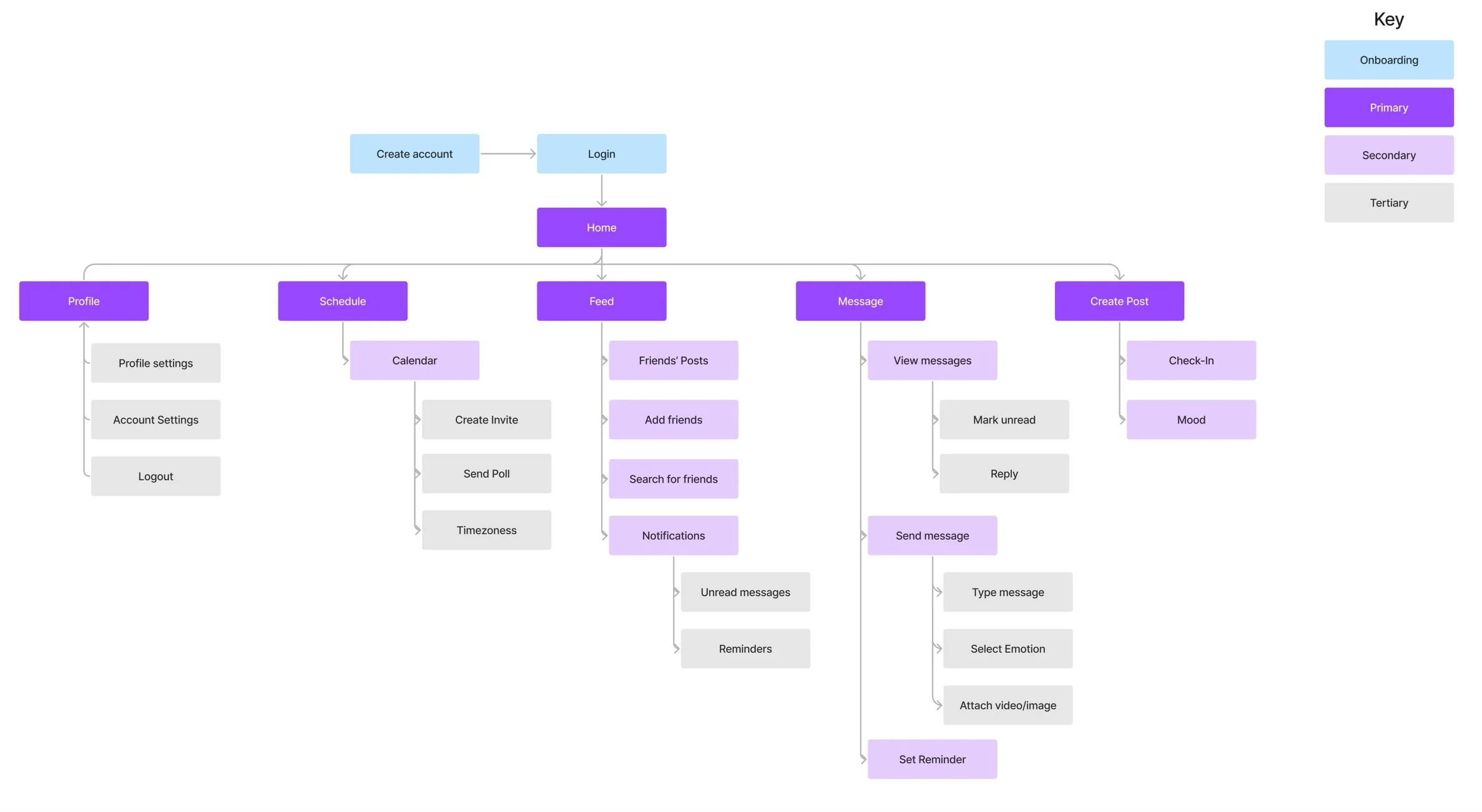
Using the prioritized user stories, I identified content/pages from my user stories and grouped them to create pages for my site map. I then organized those pages into a site map to display the hierarchical organization of my application. This helped me to begin visualizing what the product might look like and helped me to know what screens might need to be designed.
User Flows
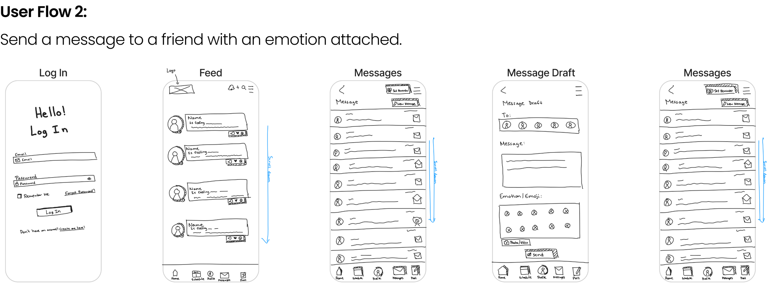
Using pages organized from my site map, I identified the steps users would take to navigate through three frequently used red routes. Identifying user flows allowed me to clearly define and visualize how a user would complete common tasks. The three red routes and user flows included:
Sketches
Using the three user flows I identified and taking initial ideas from my rapid brainstorming session, I sketched ideas for the screens that the user might interact with while completing tasks and using the app. While sketching, I focused on making the product intuitive, simple, and familiar to users to allow them to quickly and easily interact with friends.
Low and Medium-Fidelity Wireframing
Using the sketches, site map, and user flow diagrams, I created low-fidelity and medium-fidelity wireframes in Figma.
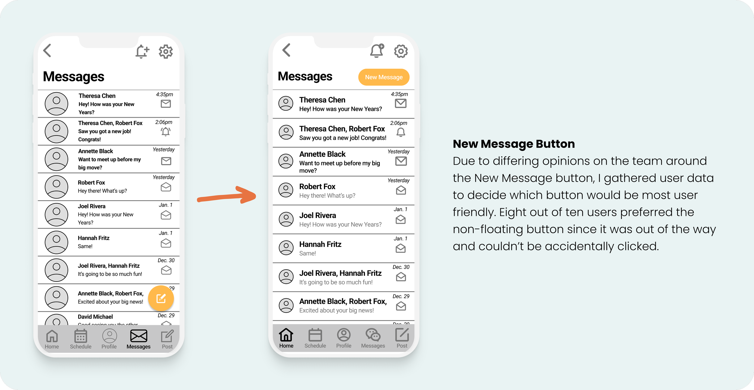
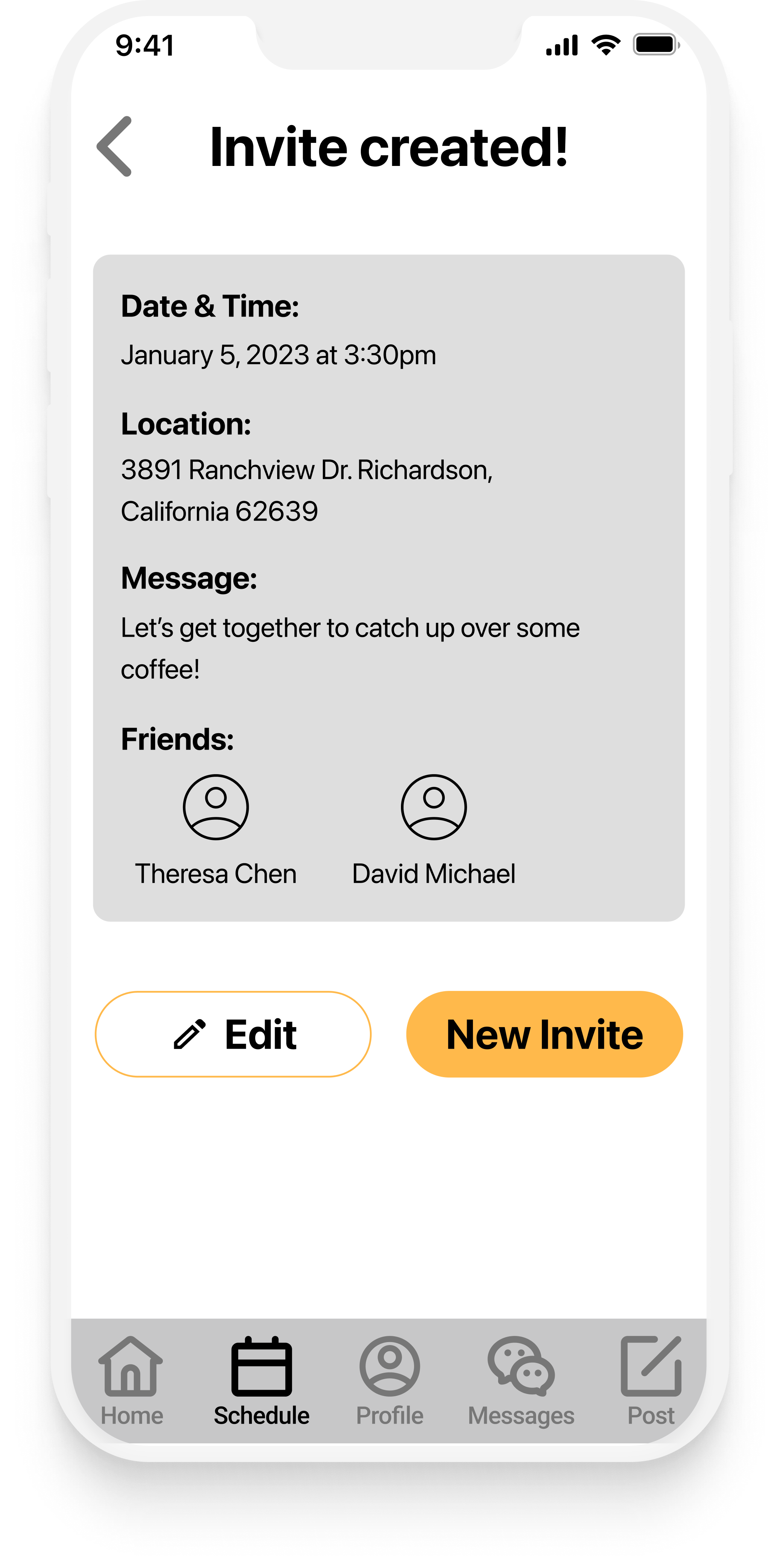
While designing the wireframes, I focused on the information hierarchy by including aspects such as cards, date pickers, and font weights to help users navigate through the content on each page. I also kept best practices at the forefront to ensure features like the messages, calendar, and navigation were familiar and intuitive for users. During this step, I used user data to help inform key decisions, including what button type would be most user-friendly for new messages.


Design
Brand Platform and Moodboard
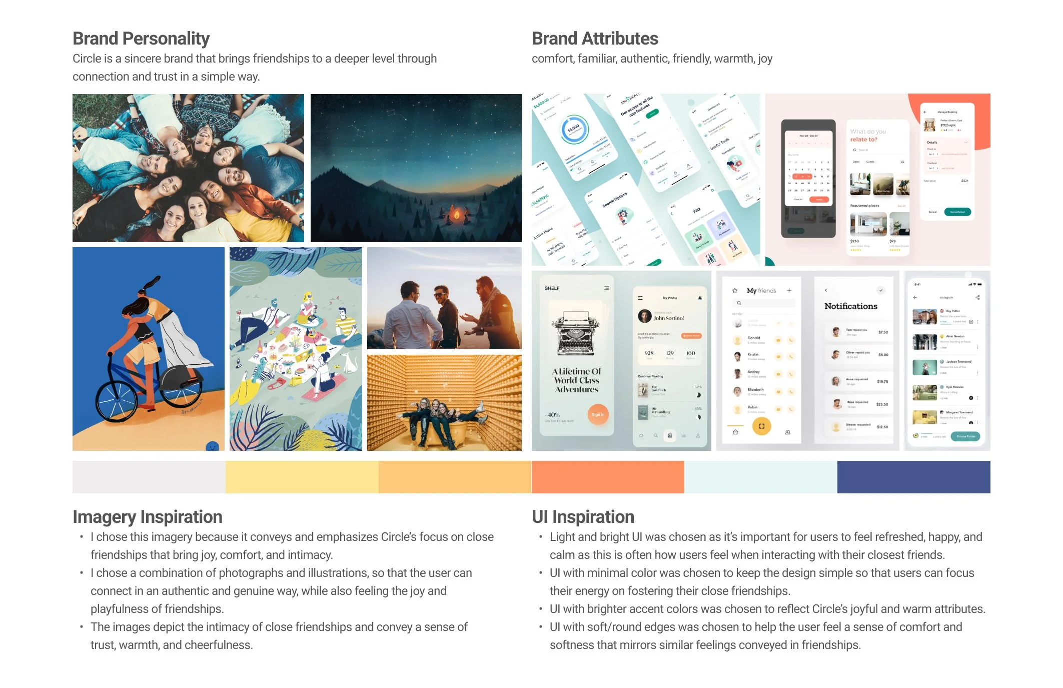
Once the wireframes were complete, it was time to add color and bring Circle to life! The name Circle was chosen as it aims to help close circle of friends connect. I additionally wanted to convey a sense of togetherness/closeness and a circle is an enclosed shape. Circle’s mission/vision is to create authentic and meaningful connections for every circle of friends from anywhere in the world, and its brand attributes are comfort, familiar, authentic, friendly, warmth, and joy, which are also reflected in the colors and UI inspiration chosen for the mood board.
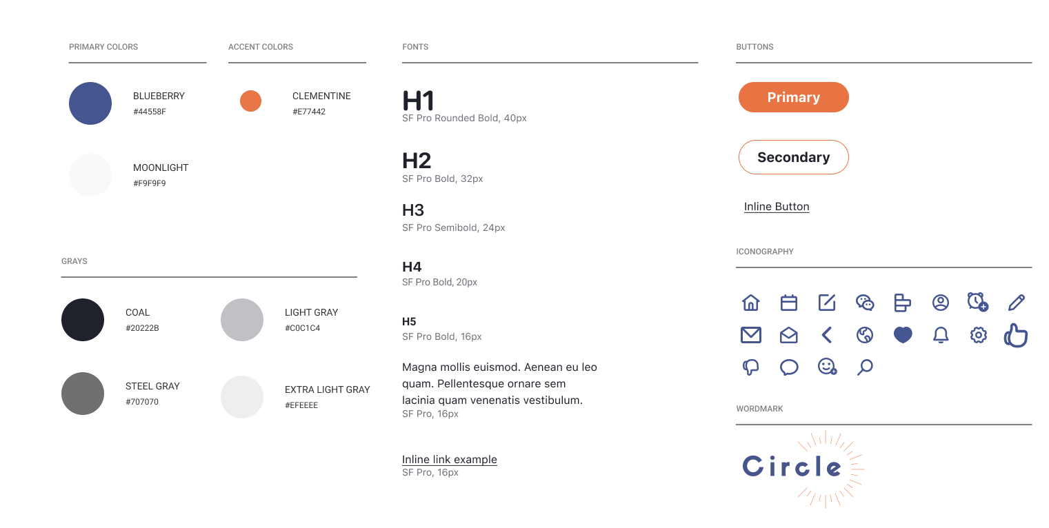
Style Guide
The mood board and brand platform gave inspiration for creating the style guide. The style guide was built to include cohesive fonts, colors, icons, and a logo that conveyed calm, comfort, and warmth. The initial style guide included additional primary and accent colors, but as the product was designed, I decided to reduce it to a few colors to convey a sense of simplicity and ease to my user to mirror the simplicity that should come with connecting with friends.
Hi-Fidelity Wireframes
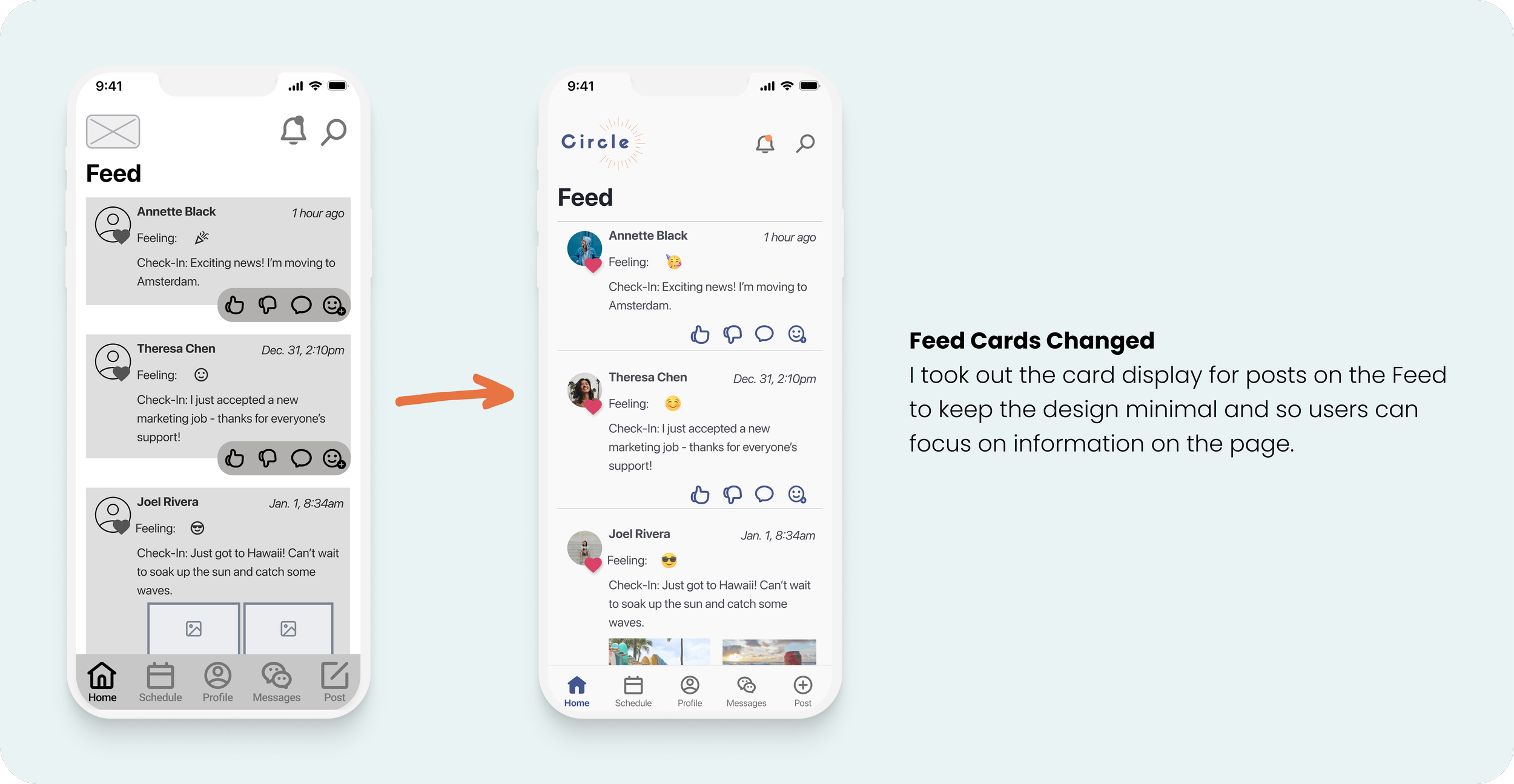
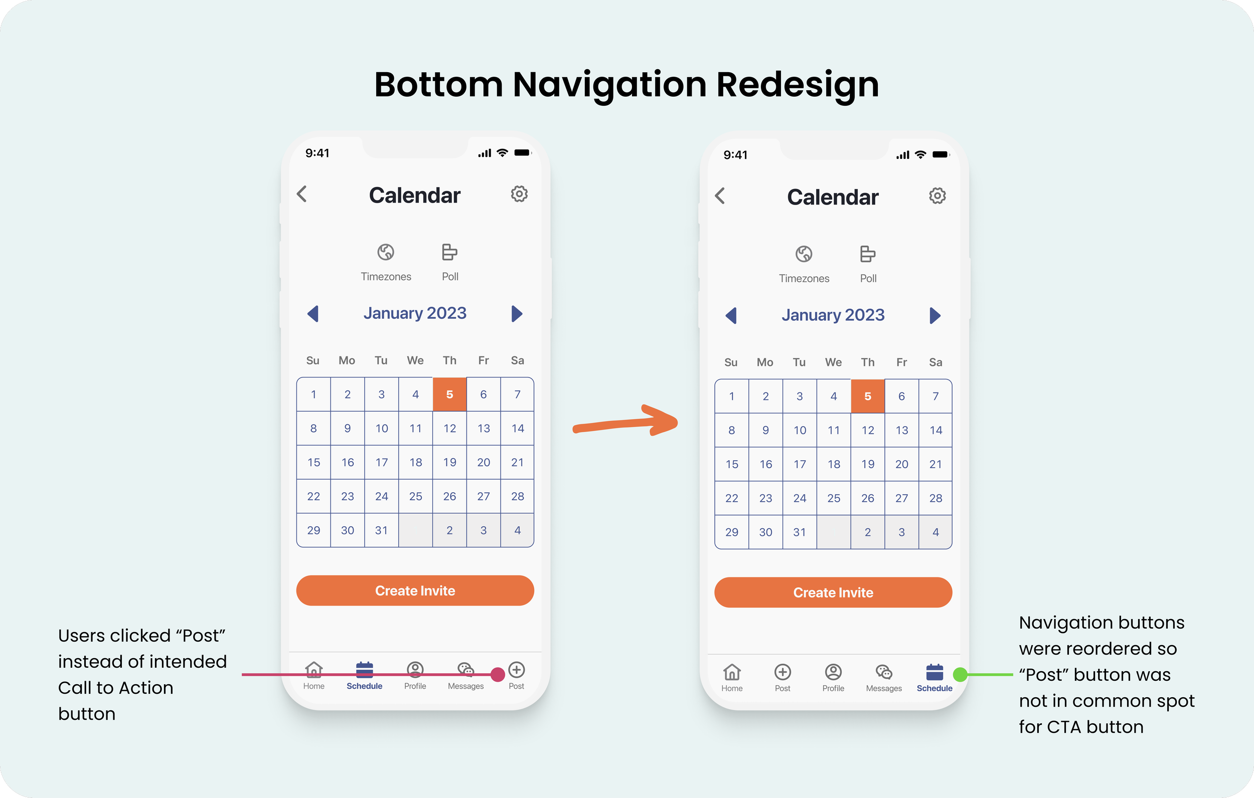
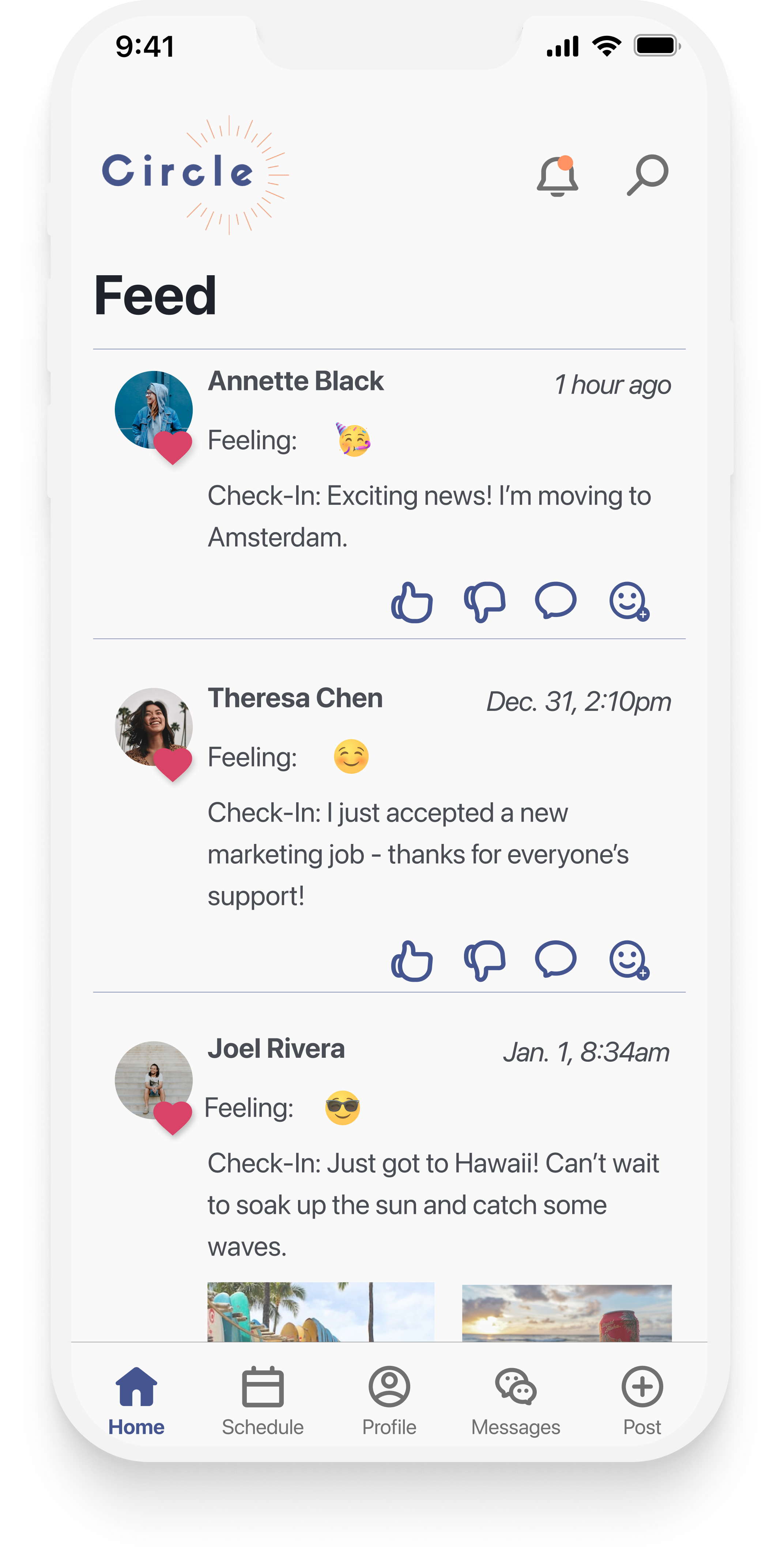
When applying the style guide to design the high-fidelity screens in Figma, I aimed to create a cohesive user experience and continued to make new iterations and adjustments to the designs that prioritized simplicity and minimalism so users can focus on interacting with friends. As I took the designs from my low-fidelity wireframes, I used color, font, and padding to create information hierarchy and create space so the design was not crowded. A couple of key iterations, included:





Prototype
With the initial hi-fi wireframes complete, I used Figma to build an interactive prototype for further usability testing. As I brought the product to life and connected screens and buttons to make it interactive, I continually thought about how my users might interact with the screens and made adjustments to ensure that the product was intuitive and simple for the user.
Test
Usability Testing
Using the completed prototype, I completed moderated user testing via Zoom with five users who met the criteria of wanting to connect more with their close friends. During testing, users were asked to complete the following five tasks, and all users completed them successfully:
You want to sign into the Circle app to communicate with your close friends. Show how you would sign into the app.
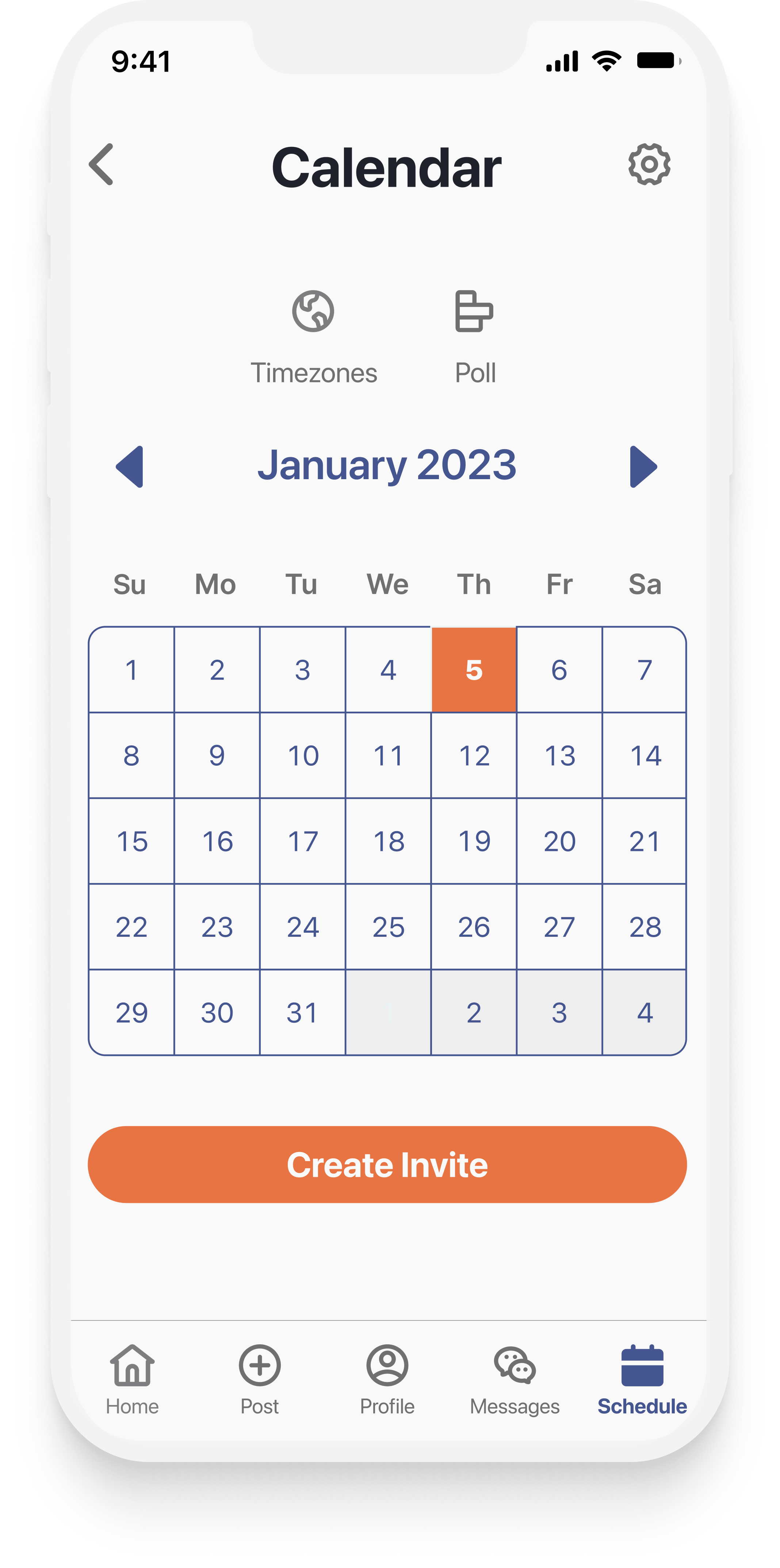
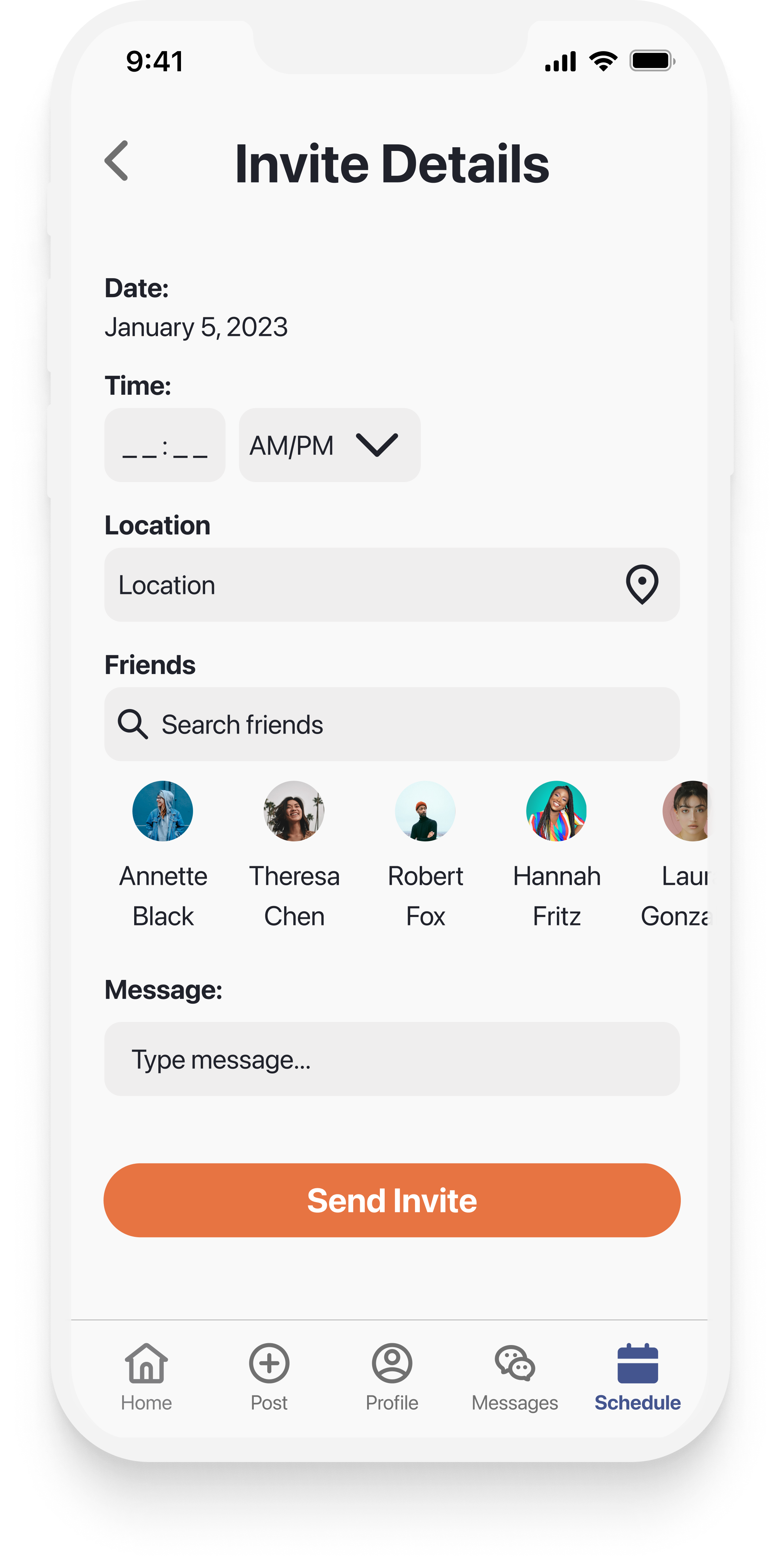
You’re planning to get together with your friends to hang out on January 5th. Show me how you would send an invite to hang out with your friends.
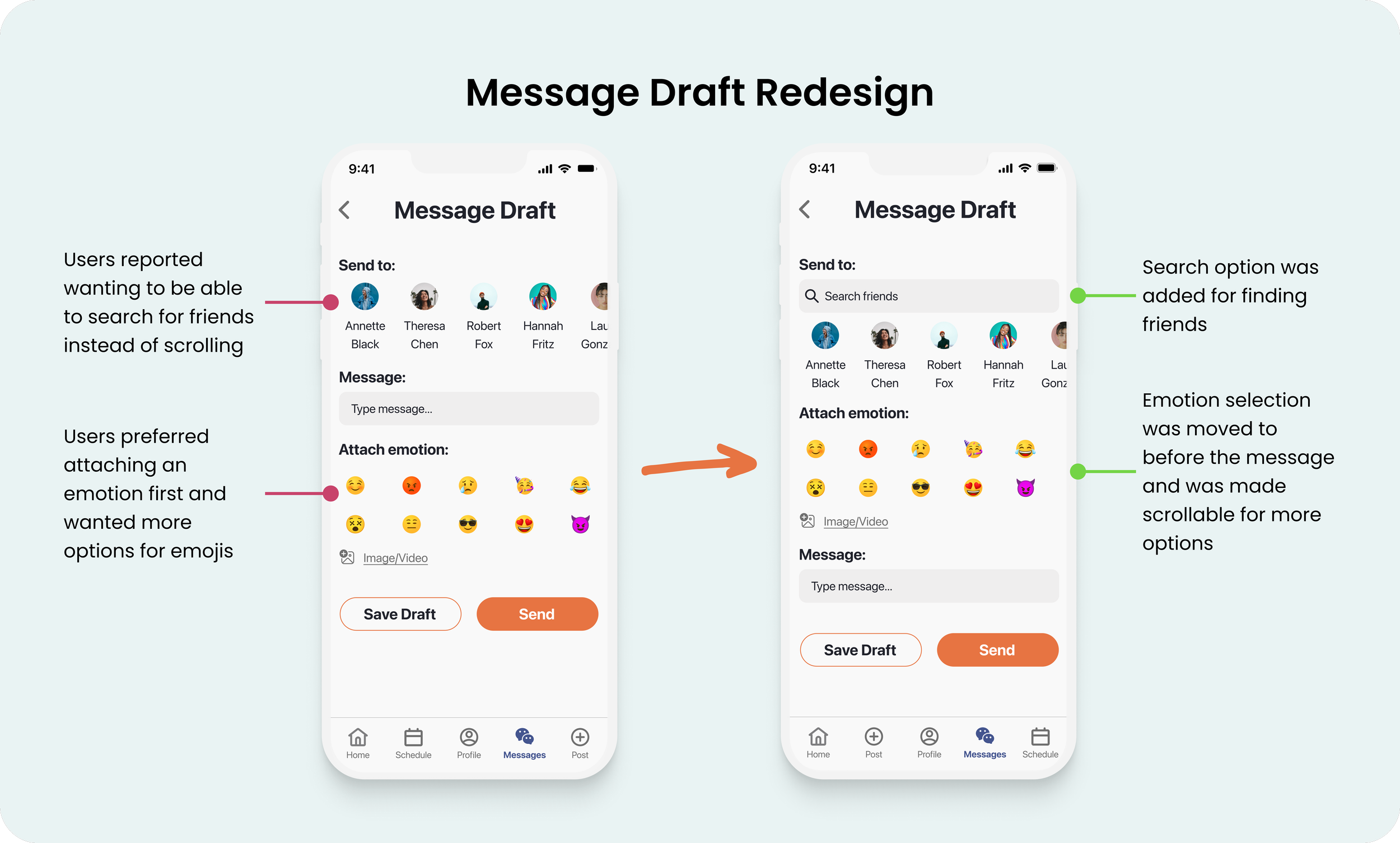
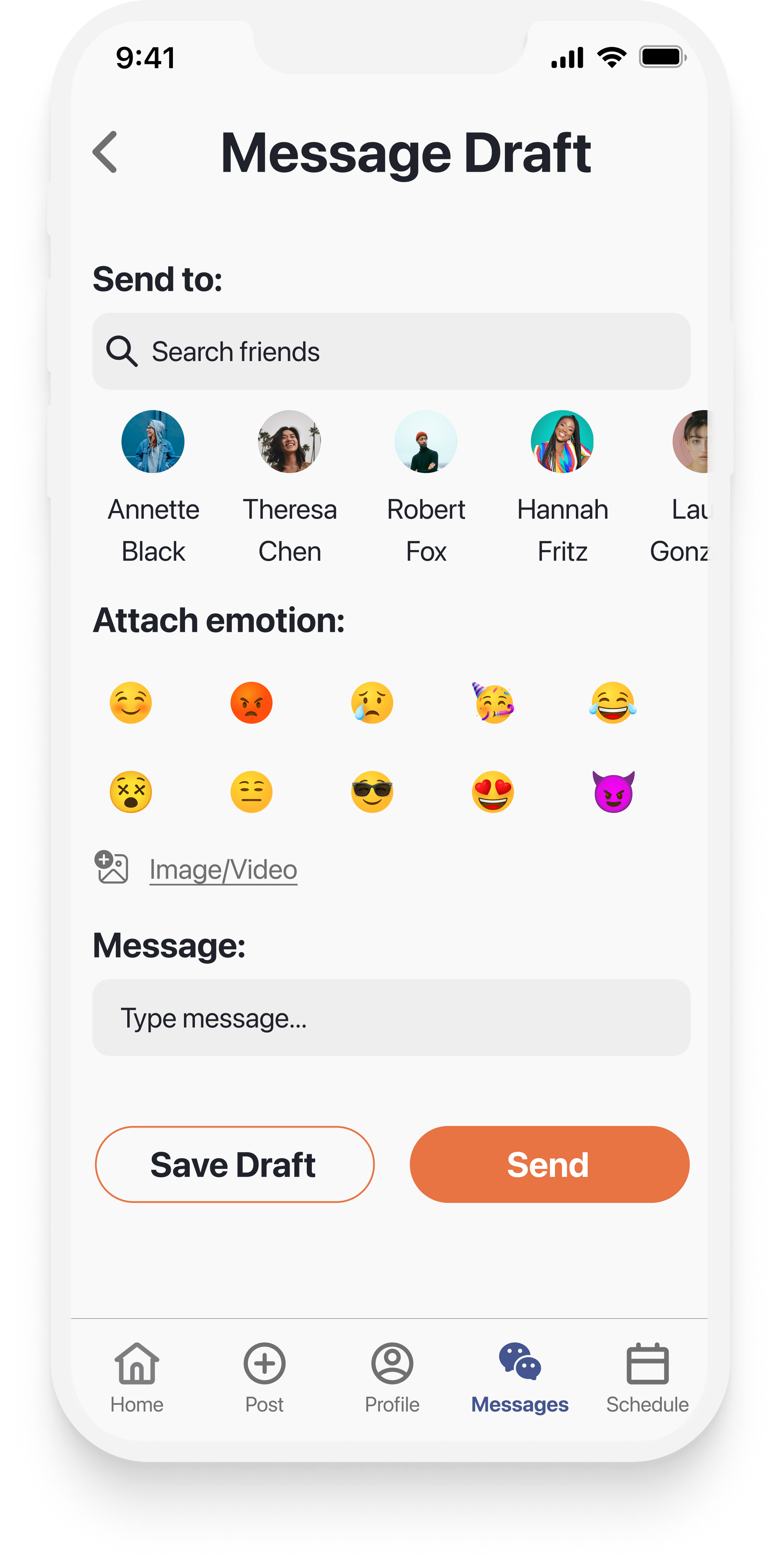
You want to start a chat with a friend, and you want them to know how you feel to give context to your message. Show how you would start a conversation with a friend within emotion attached.
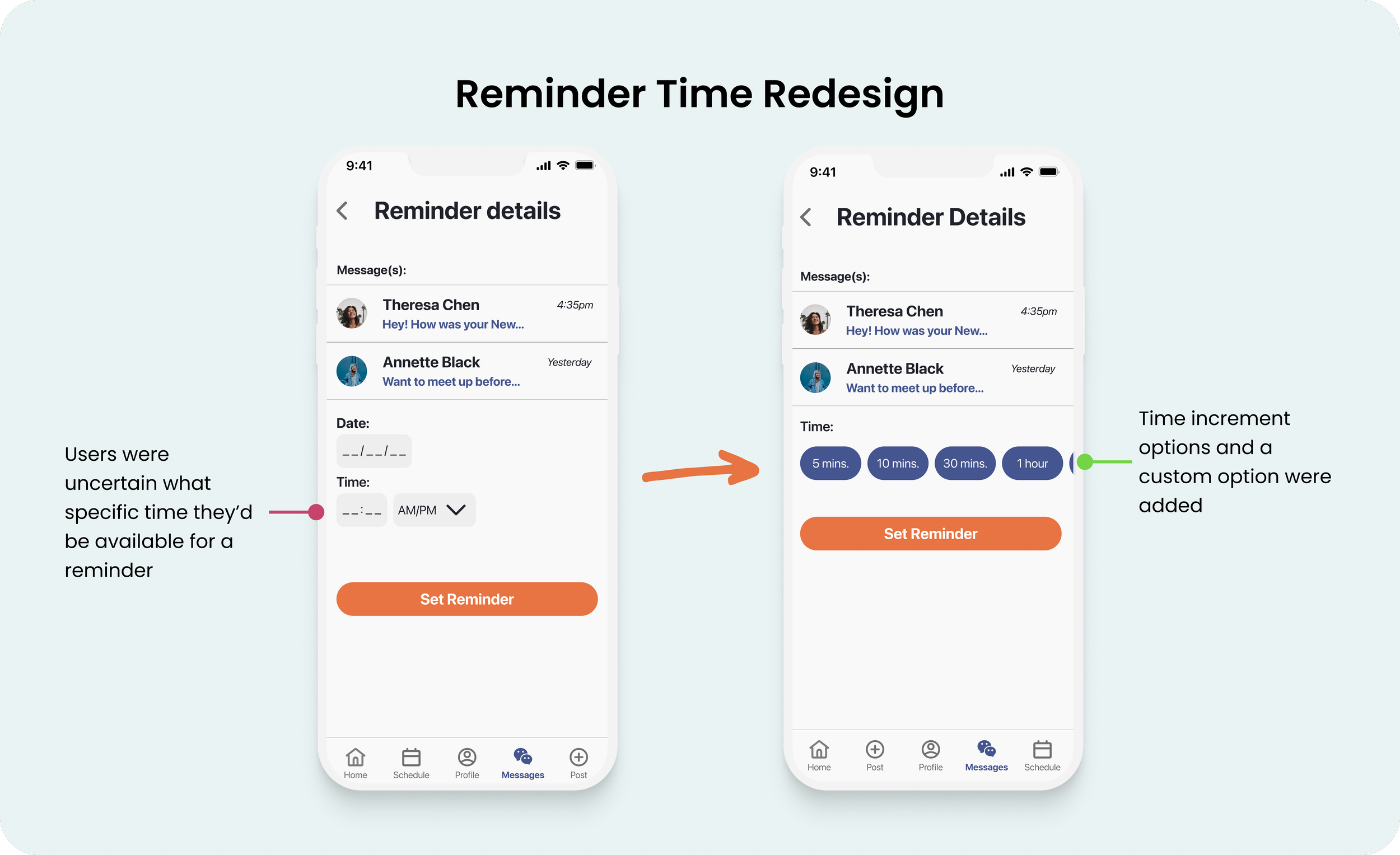
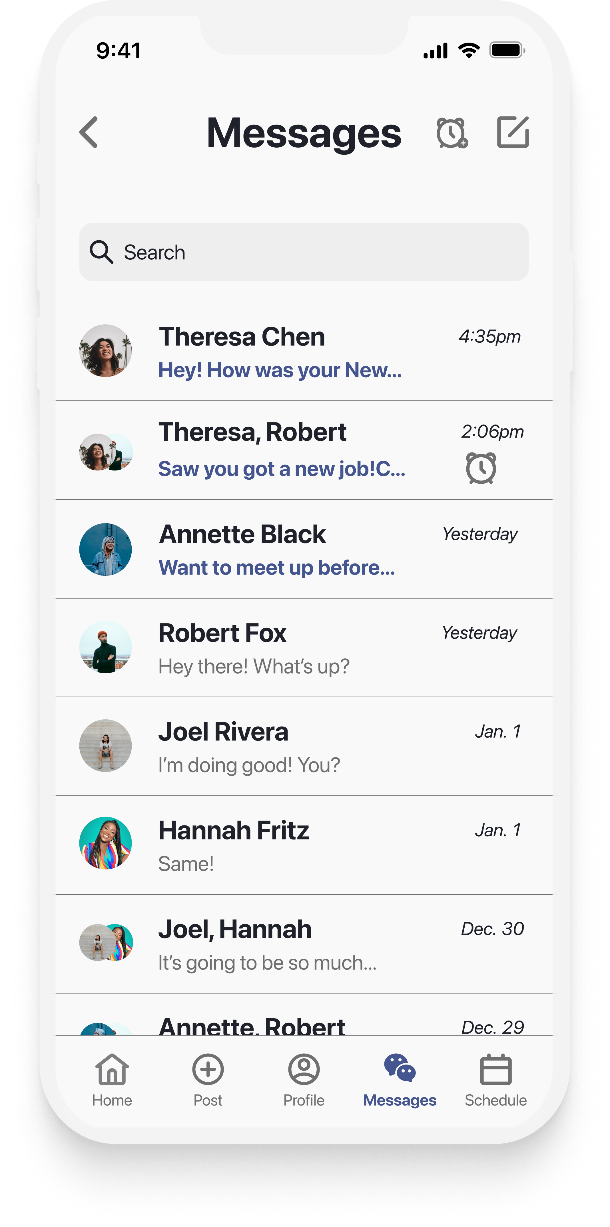
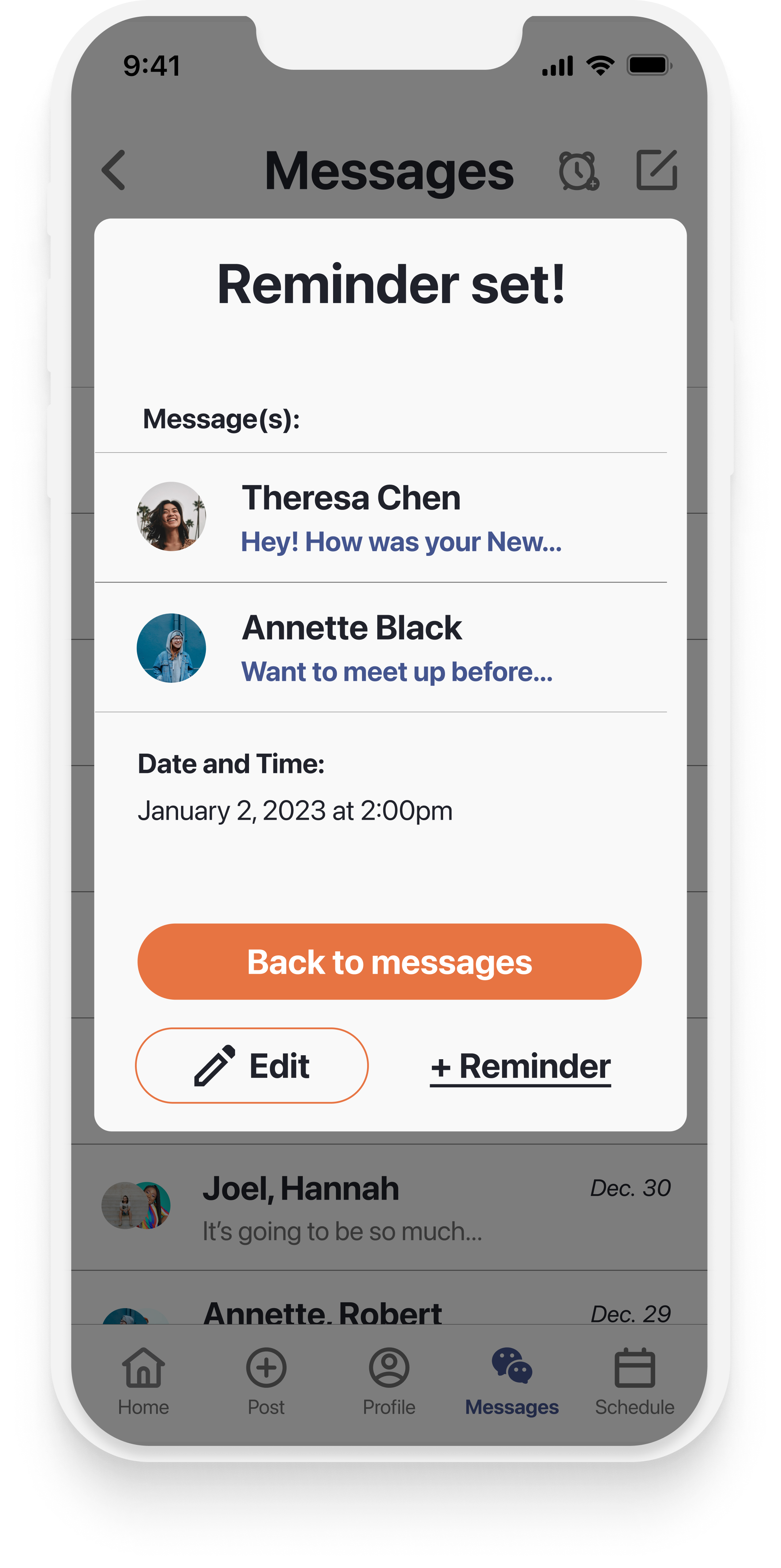
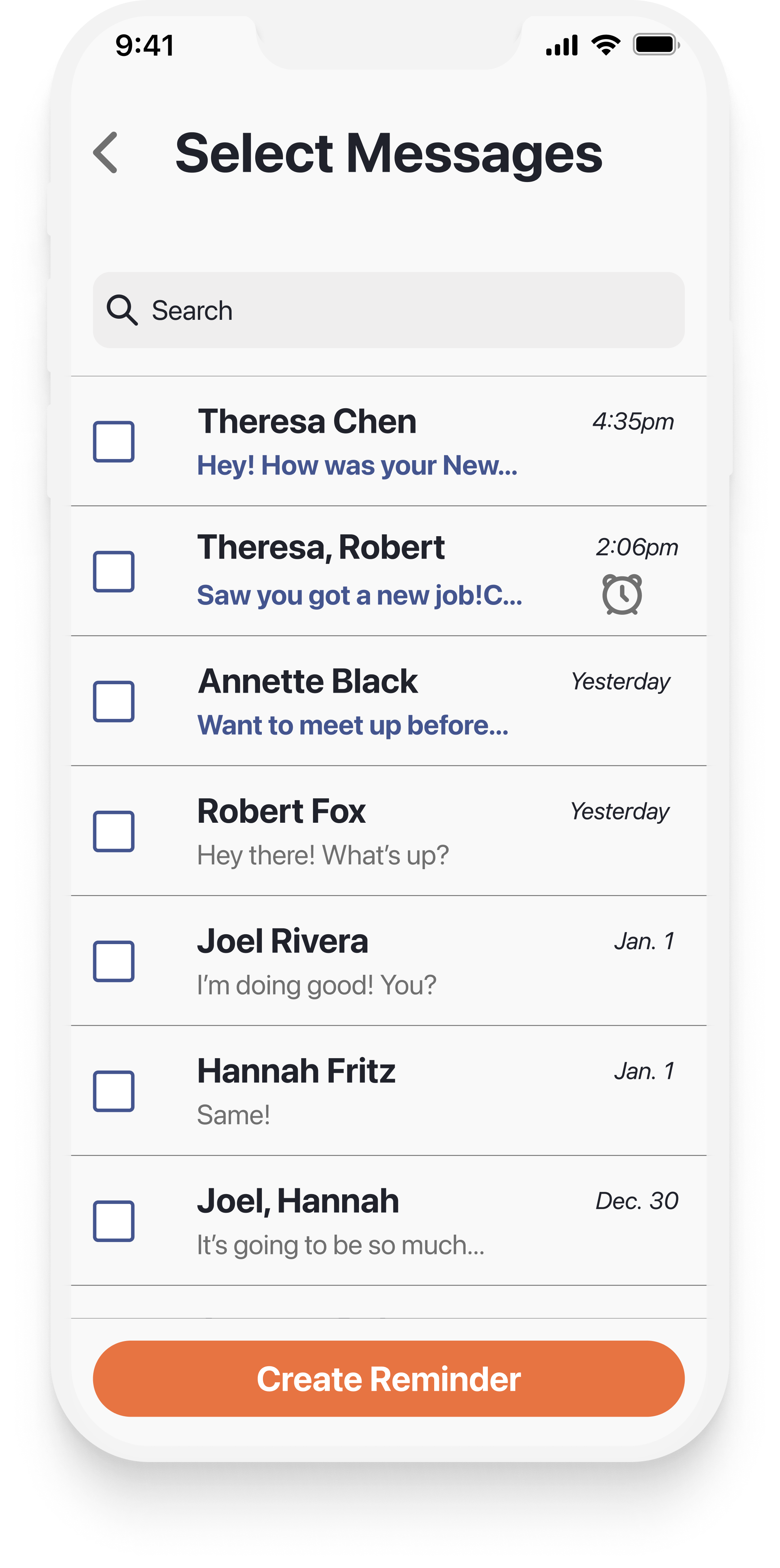
You have unread conversations from your friends Theresa and Annette but are busy and want to remember to respond later. Set a reminder to respond to these conversations at a later time.
After completing the usability testing, I used affinity mapping to organize the findings and identify patterns:
Based on the common pain points and issues I found during affinity mapping, I prioritized the following issues and recommendations going into the redesign:
Redesign and Final Hi-Fi Mockups
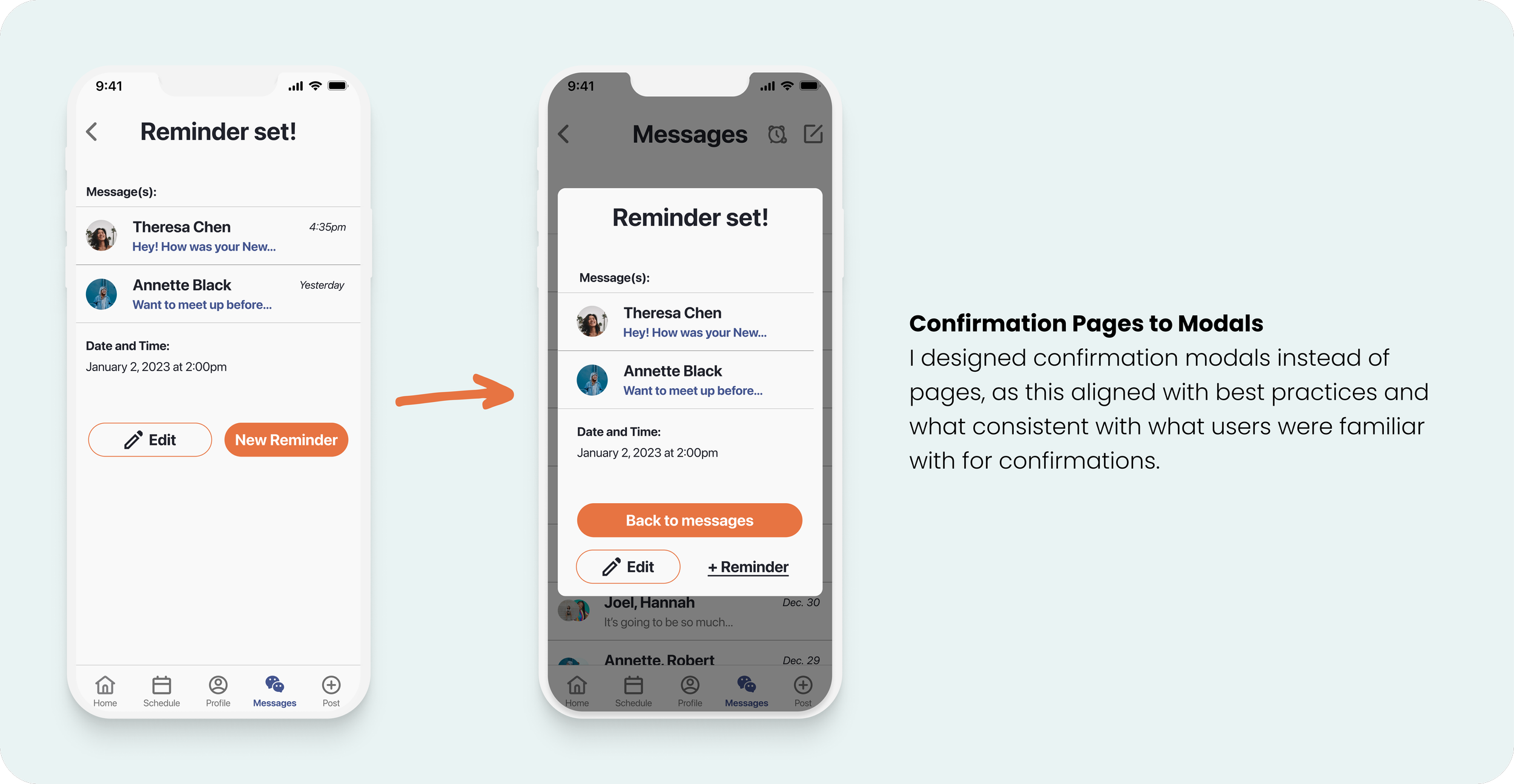
To address the major and minor issues that were identified during usability testing, I made the following changes and redesigns:
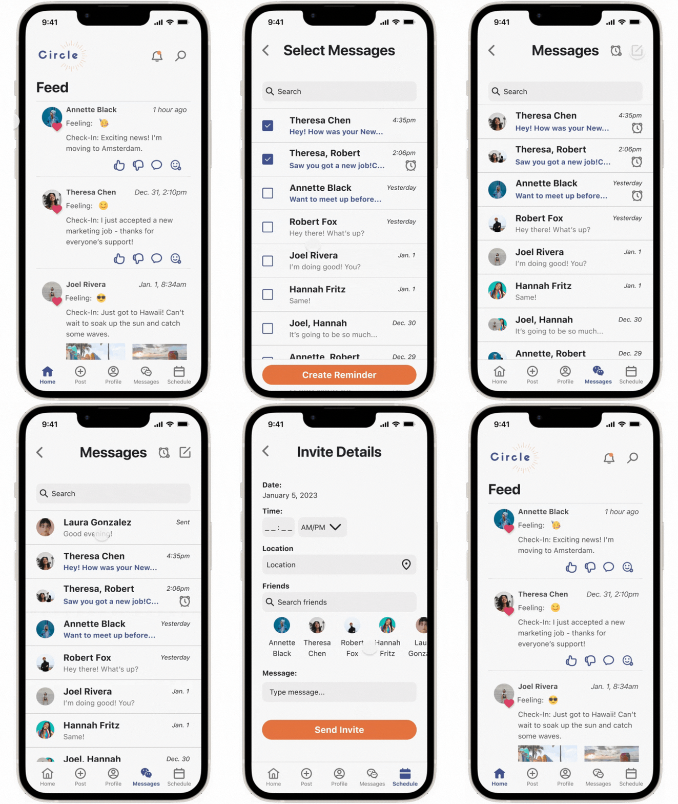
After implementing those changes in the redesign to improve the user experience, the final hi-fi mockups were complete:



Reflection & Next Steps
Reflection
I love designing for everyday users!
For this project, I had the opportunity to design a B2C product that your everyday, average person might use to help them solve a very common problem: connecting with friends. Knowing that this product could help people like my friends, sister, family, or acquaintances made this an even more rewarding experience as I felt it had a personal weight to it. That also made the empathy process fun and allowed me to really think about how my users might interact with the product and how best to support their needs. Overall, I've learned that I really enjoy designing for everyday people and everyday consumers!
Research is an ongoing process through designing a product.
Asking users for feedback throughout the process can provide so much insight and really helped me at points where I was at a crossroads with a design or navigation. For example, during my wireframing process, I was deciding whether to have a floating button for a new message or a button at the top navigation bar. I ultimately decided to ask users for feedback. This helped me to move forward in my design process while also ensuring the design and navigation were aimed towards my users. It's a great reminder to always keep it user-centered!
Before I know what I’m designing, I need to know who I’m designing for.
When I was an educator, a quote that always stuck with me was, “Before I know what I’m going to teach, I need to know who I’m going to teach.” (Cornelius Minor). I also utilized this while designing Circle and empathizing with my users, which helped me design a product that was intuitive, engaging, and met my user's needs. Centering my design around my users and specific problem also helped when considering how to set Circle apart from other social media platform competitors. Keeping this mindset at the forefront allowed me to build out Circle's unique features and design a successful app to achieve the goal of helping users feel more connected to their close circle of friends.
Next Steps
It would be a great opportunity to grow and build Circle even more to help users continue to feel connected to their circle of friends. Some next steps for Circle might include:
Including features for friends to get real-time updates about where their friends are or what they are up to
Integrating the Calendar feature with a user’s personal calendar that already exists on their phone
Allowing users to quickly send a notification to say “Hello!” or “Thinking of you!” without having to take time to send/write a message
While keeping the future of Circle in mind, the takeaways and lessons I’ve learned while designing Circle have helped me grow immensely as a UI/UX designer, and I’m excited to apply them to the next product, while also continuing to grow and learn even more in future design endeavors!
Thank you for learning about my design process for Circle!
Interested in seeing more or getting in contact? Use the links below to check out my other projects or get in touch!
