RecoverWays
Providing community and peer support to those impacted by substance use.
Role
UX Designer
UI/Visual Designer
Tools
Figma
Timeline
7 months
Overview
Supporting a loved one through alcohol and drug use can feel lonely, exhausting, and overwhelming. Often, people feel like they’ve explored all their options and don’t know where to go for support next. Additionally, there are many kinds of resources, and narrowing down which is most helpful is also an overwhelming, time-consuming task. RecoverWays is a website of health resources that aims to provide a place where loved ones can go when they’ve exhausted all resources and are looking for more help.
Problem
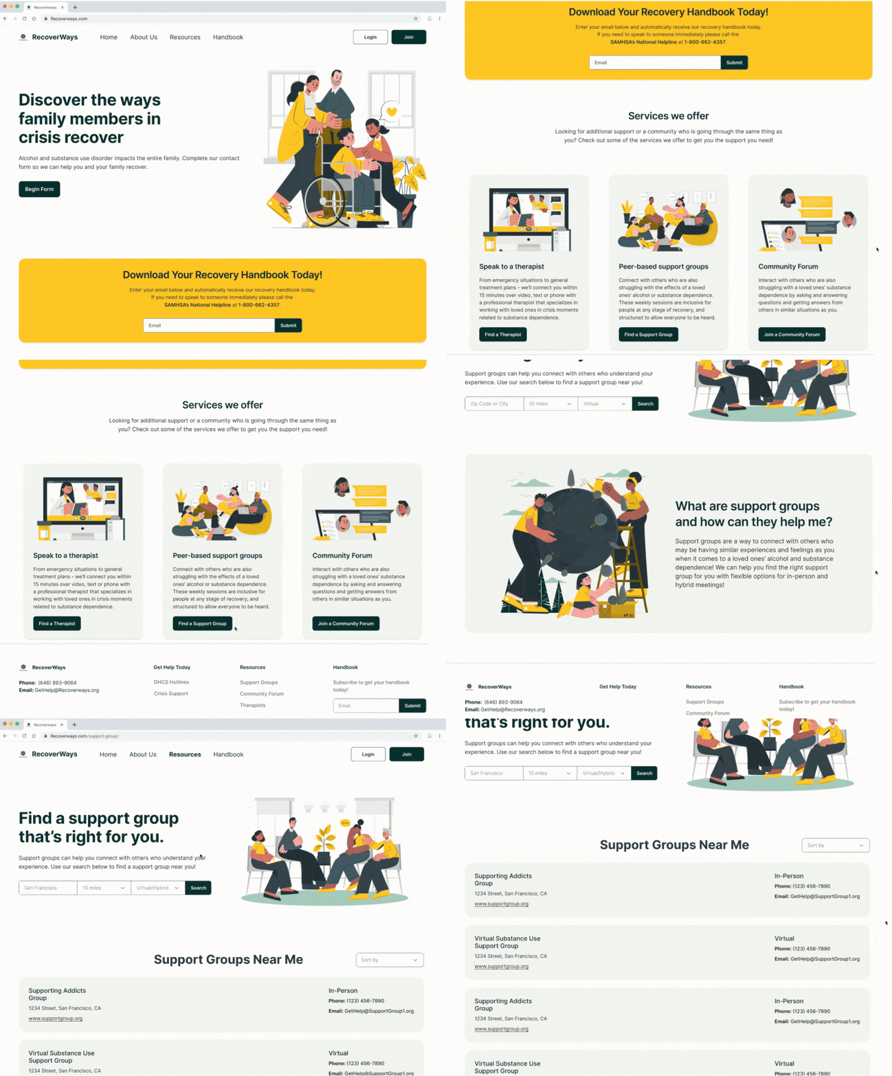
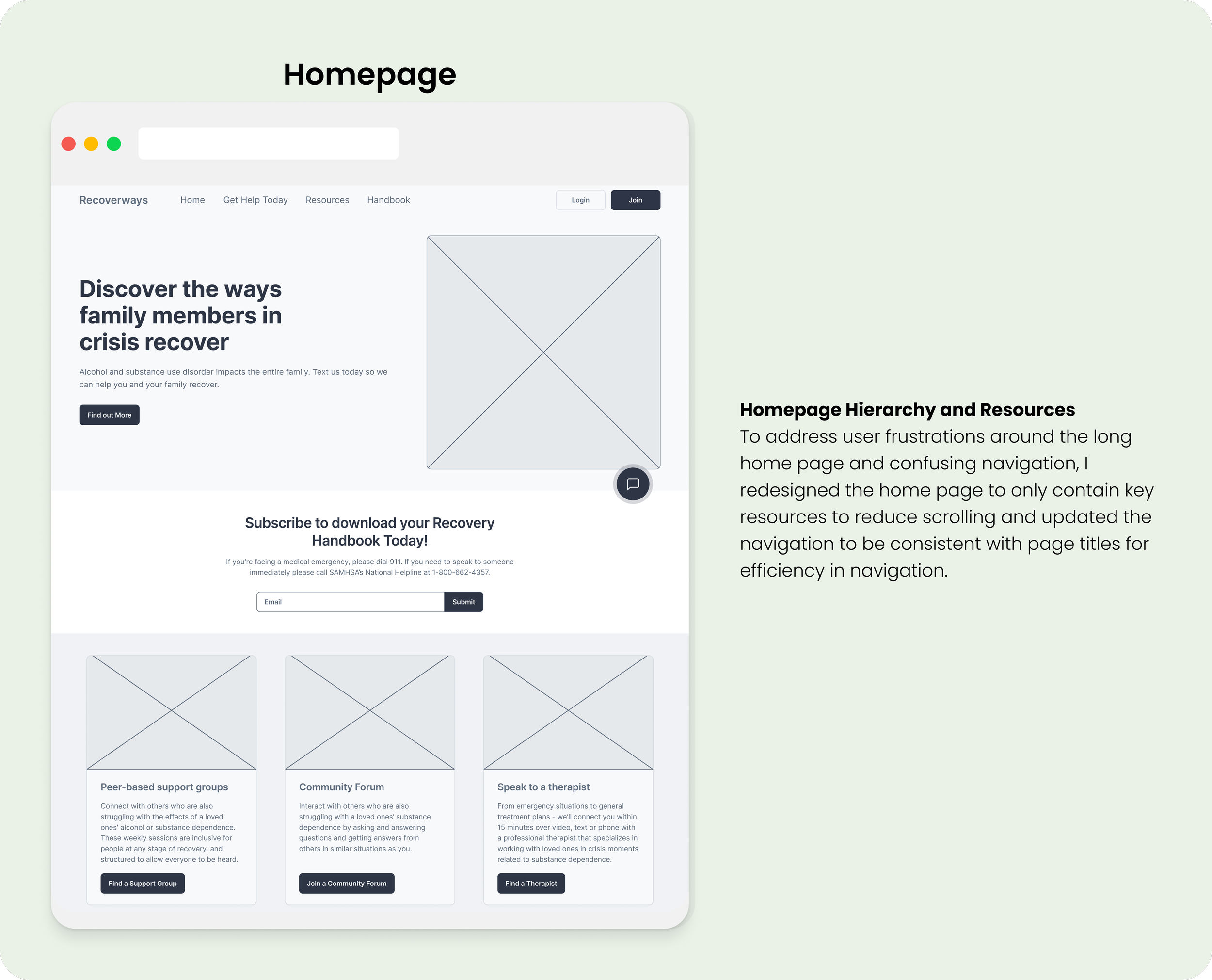
RecoverWays current platform requires users to navigate to multiple pages or scroll to find the help they need. Also, the current homepage has listed unavailable resources and does not have user-friendly navigation for crisis triage. Users reported feeling frustrated by the lack of resources and wanted to be able to quickly get help without having to provide extensive personal information.
Solution
Our team identified two areas of improvement for the redesign, including:
Updating the navigation and information architecture so users can easily navigate and find needed resources efficiently.
Designing new features, including a community forum and support group page to increase user satisfaction and provide additional resources.
Update the UI and visual design to increase feelings of calm, welcoming, and support in users.
Discovery
Kick-Off and Client Questions
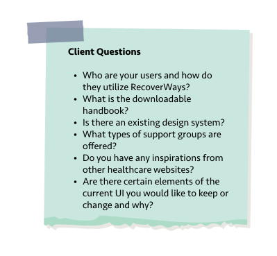
Myself and the team kicked off this project with curiosity and excitement to work on a project that had a deep impact. To better understand RecoverWays and to form a plan for the redesign, I came ready with a sticky note full of questions!
These questions gave me insight into the users and product, and helped me to form a vision of the attributes that reflect RecoverWays.
Heuristic Evaluation
With the project kicked off and my questions answered, it was important for me to understand the usability of the current website, so I took a tour through the current RecoverWays website and completed a heuristic evaluation along the way. During this, I found:
Long forms to access handbook
Website was one continuous page with no subpages to navigate to
Therapist, support groups, and community forum weren’t interactive
Sections were duplicated on homepage
Navigation titles did not match sections and were scroll based
This gave me insight into usability issues and problems that I could brainstorm solutions for going into the redesign.
Competitive Analysis
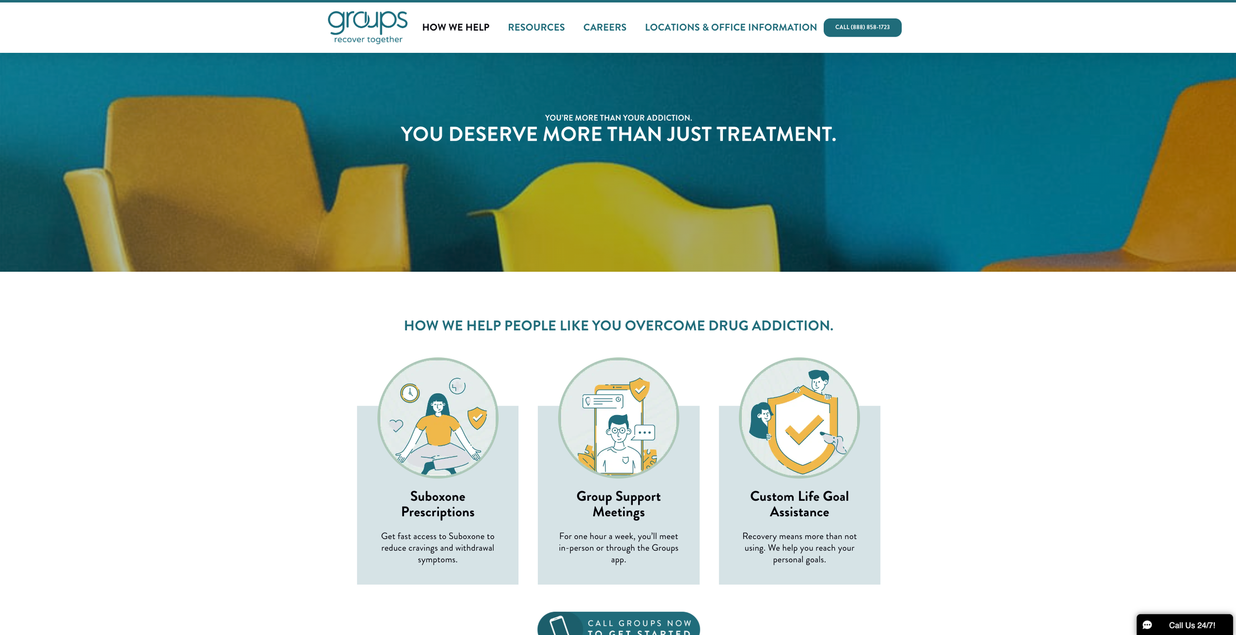
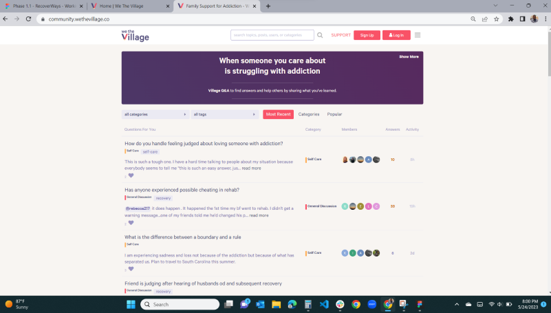
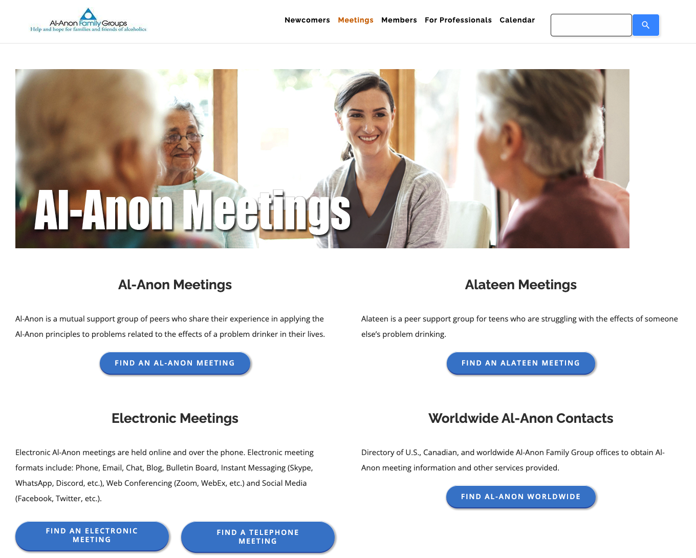
Now that I had a better understanding of RecoverWays as a website, I also wanted to see what similar healthcare platforms were doing and what sets RecoverWays apart. I used this information when ideating and brainstorming in order to consider what features would be beneficial to add to RecoverWays that users may not be getting from other currently existing products.
Personas
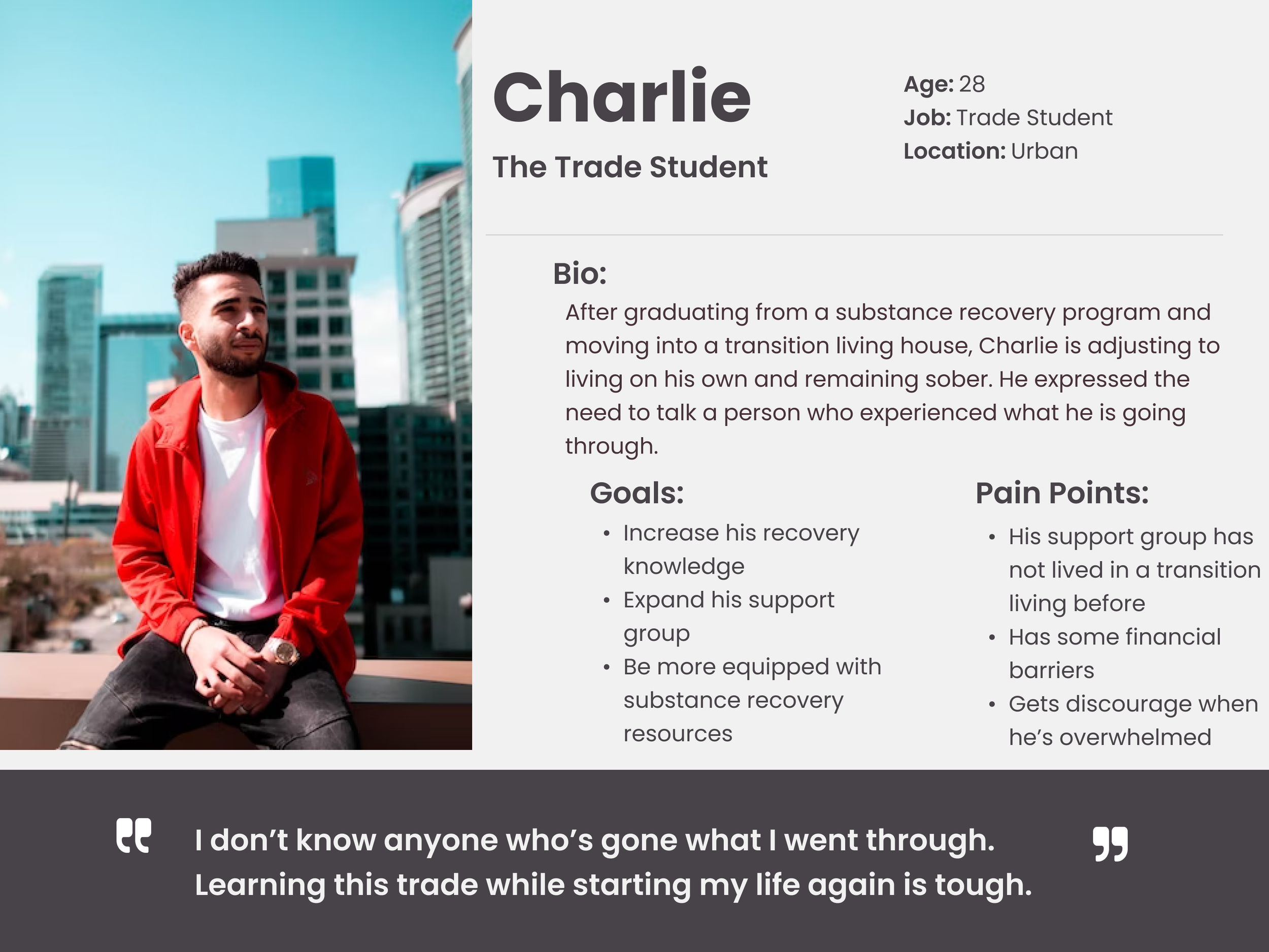
In order to fully understand the users and their pain points, I used user research data provided by the client to dive deep into what users are experiencing through two personas.
Ideation
User Stories
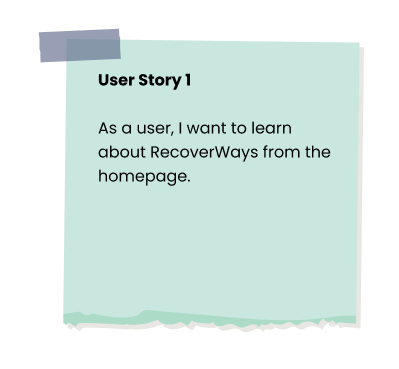
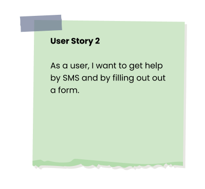
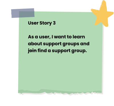
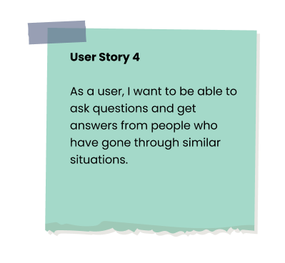
Four user stories were provided by the client to help prioritize features and flows for the redesign. I led the design process for user story 3, designing a support group page.
The original user story I led was for a user to join a support group. When I met with the client for clarification on what types of support groups are offered, I found out that the intention was for it to be a support group search feature. By collaborating early on with the client, I was able to adjust the user story proactively to reflect a search feature rather than a signup feature.
User Flows
Since I was delegated to design the support group feature, I mapped out the user flow to help me visualize steps a user might take to complete the task of finding a support group. The change of the support group page being a search feature from earlier client discussions was reflected in this flow and helped me identify interactions and interfaces to focus on going into sketching and wireframing.
Sketching
Before building the first iteration of the Support Group user flow, I rapidly sketched out ideas. This helped me understand the user flow on a deeper level, as well as quickly visualize the hierarchy and organization of the screens. These sketches would later allow me to efficiently design my wireframes so that I can focus more on the design details and less on the layout and hierarchy of features.
Low and Medium-Fidelity Wireframing
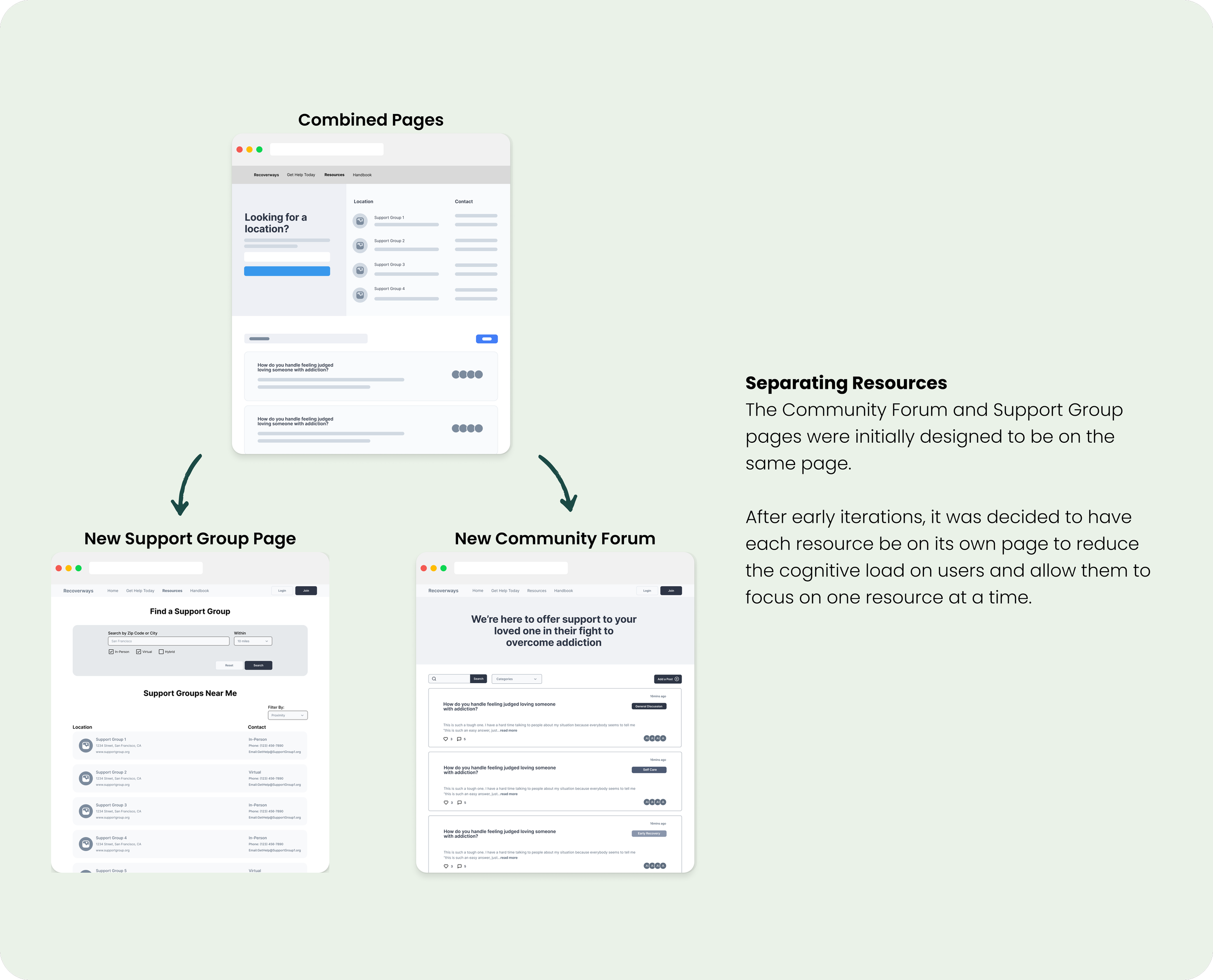
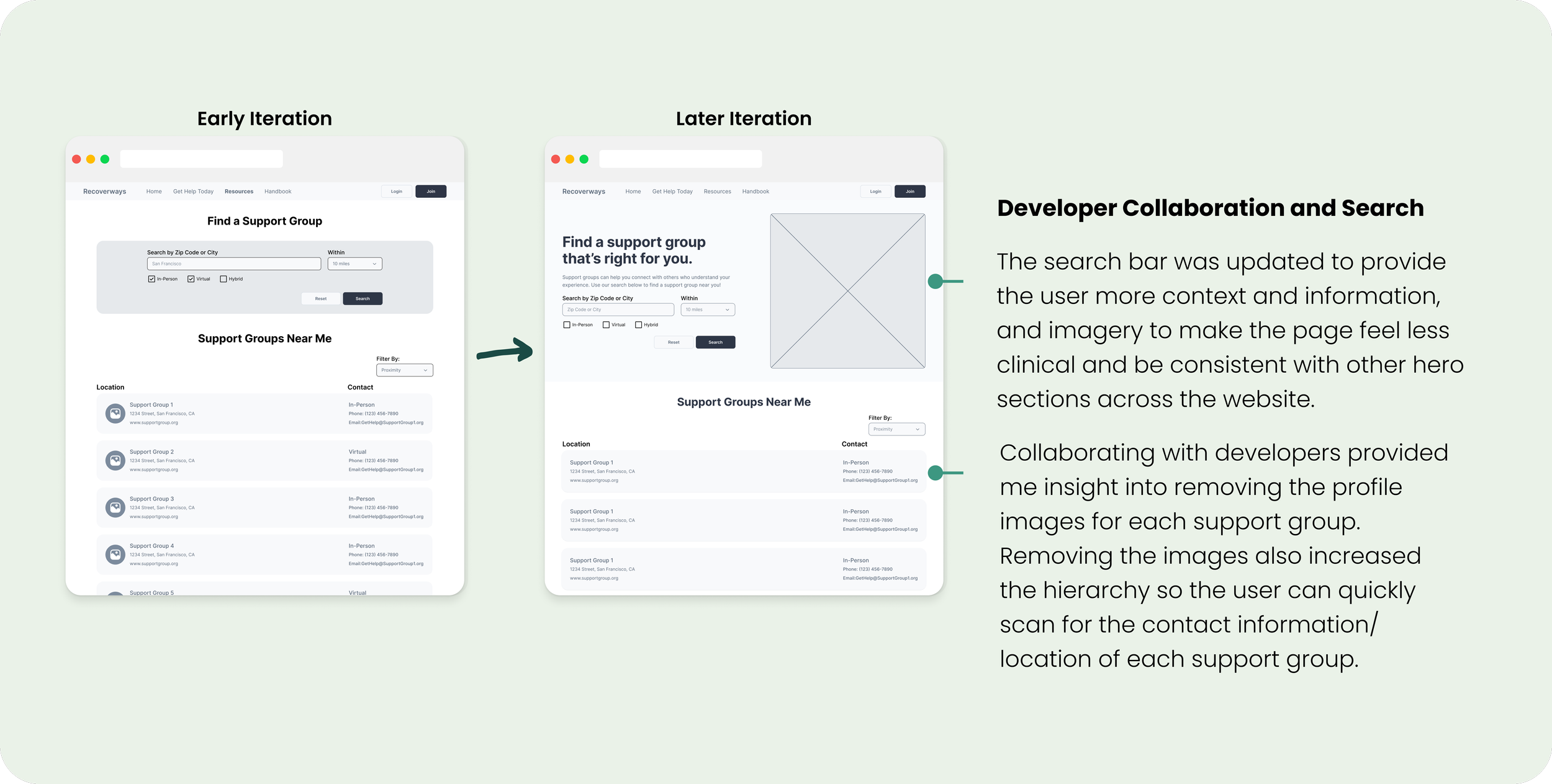
I continued to iterate as I translated my sketches into low and medium-fidelity wireframes and adjusted to team and client feedback along the way to ensure the designs met user and business needs. With each iteration of the resources and support group flows, I focused on creating consistency from screen to screen to reduce cognitive load on users, and enhanced the page hierarchy so essential resources were quickly and easily accessible.
Design
Mood Board
Before beginning to put together an initial style guide and designing the UI, I created a mood board to help give me inspiration and give me a strong idea of the branding and attributes. For the mood board, I used color psychology to choose colors that reflect healing and calm, and additionally chose imagery that reflected recovery, growth, and illustrations to reduce the clinical feeling.
UI Iterations
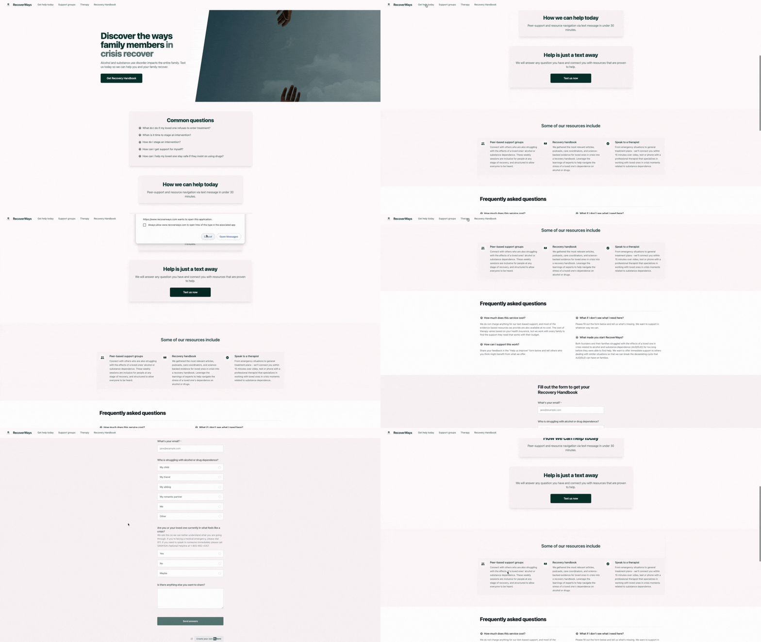
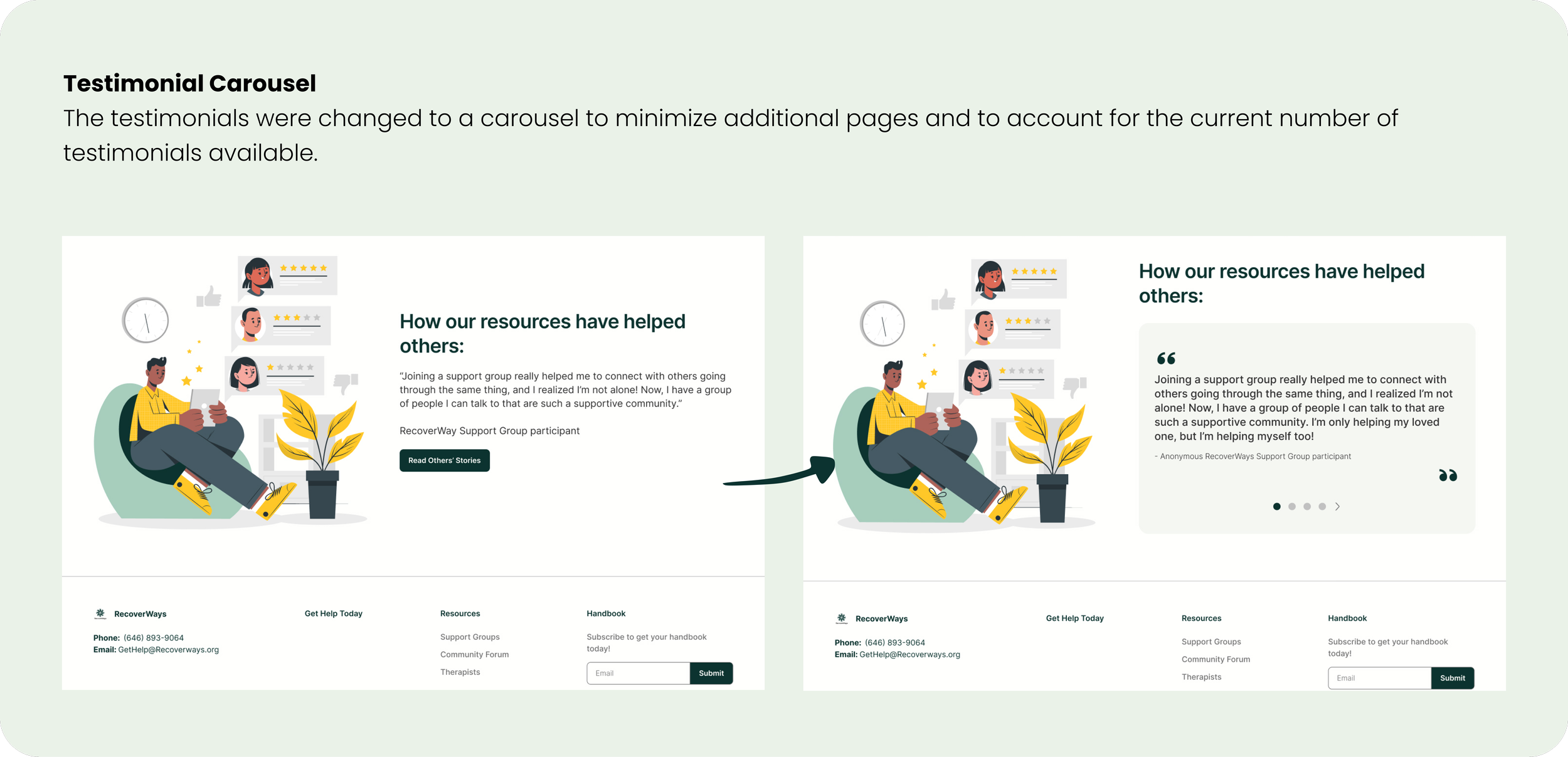
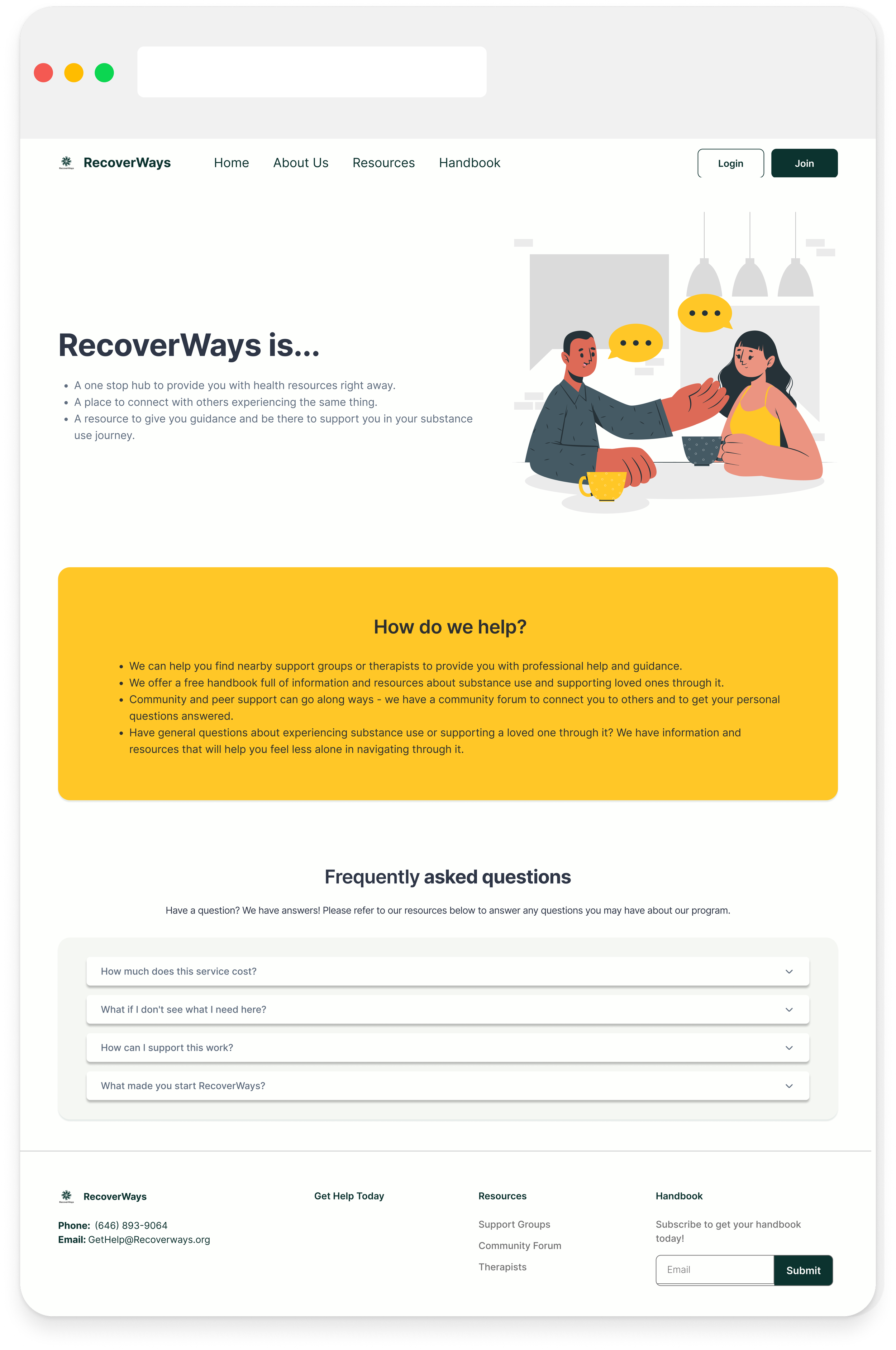
Using the moodboard as inspiration, myself and two other teammates each designed a different UI iteration of the homescreen for the client to choose from. I designed iteration #1 below, utilizing RecoverWays attributes and mission to evoke a calming, trusting and healing feeling and keeping a simple, minimal design. The client ultimately chose my iteration as it matched his vision of a simple, clean, non-clinical design. This gave the team a shared vision and as reference to create consistency as we implemented the UI on the hi-fi mockups.
Updated Style Guide and Design System
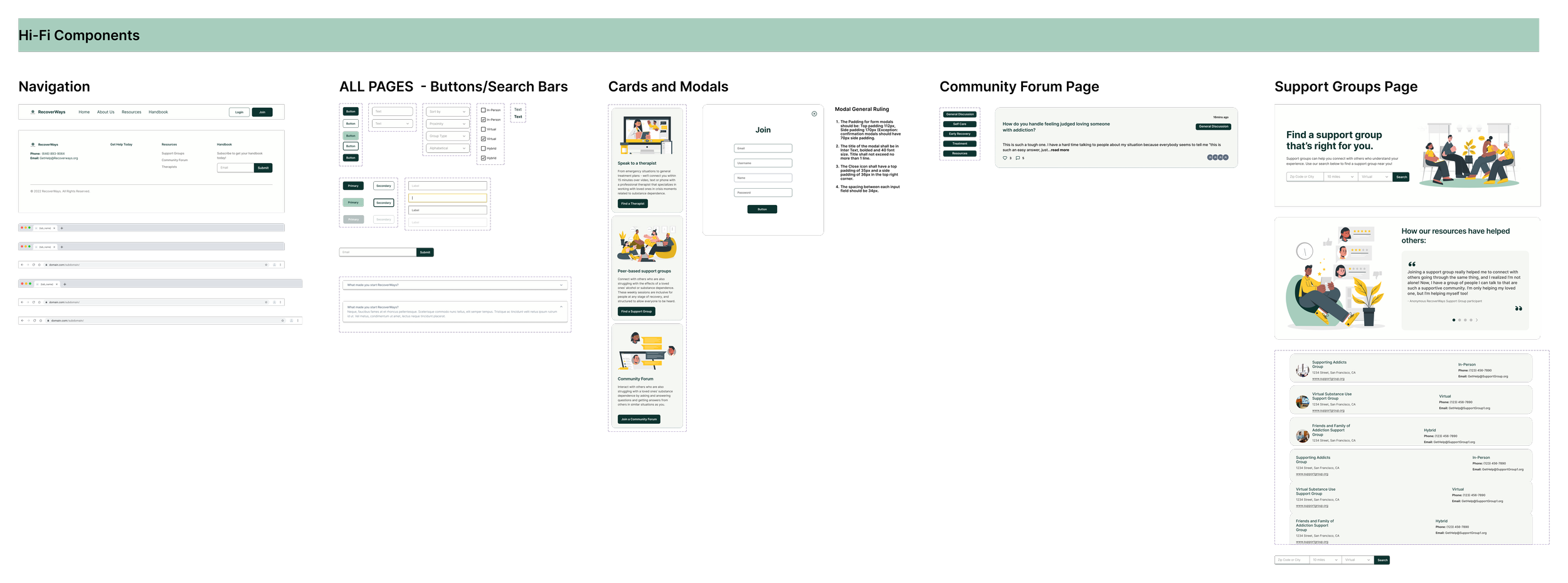
With the UI iteration chosen by the client, I began to implement the UI design elements across the interfaces by updating our style guide and applying the colors and text styles to the growing component library and design system. This made the rest of the design process efficient and allowed for consistency amongst the team in our designs.
Hi-Fidelity Wireframes
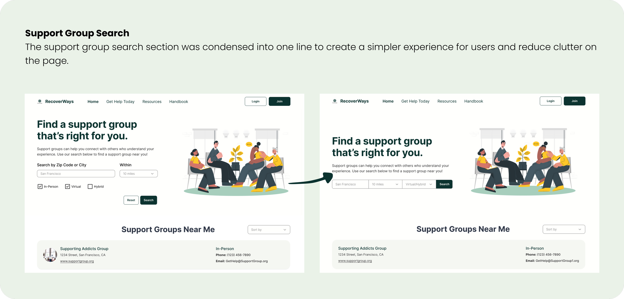
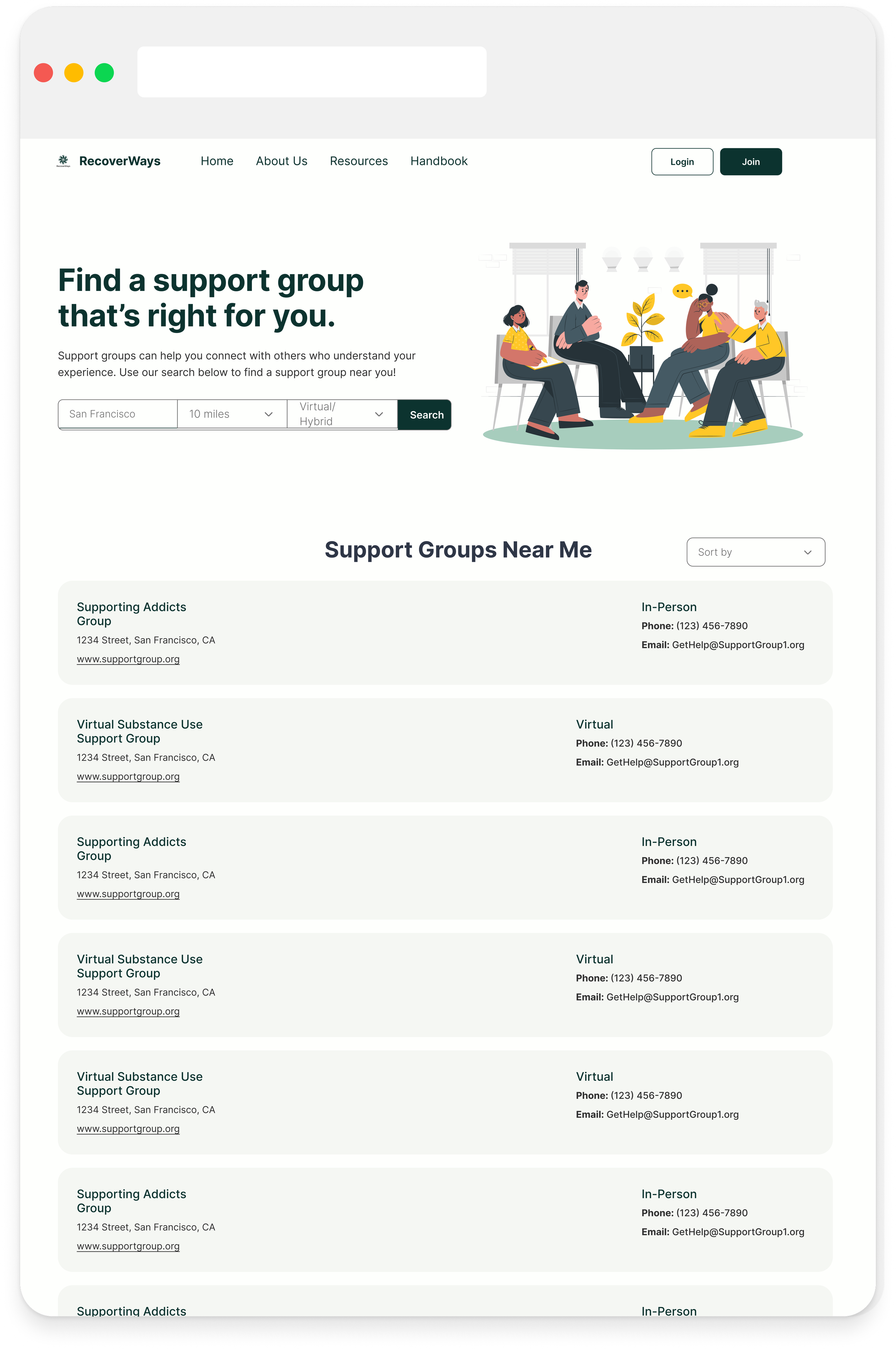
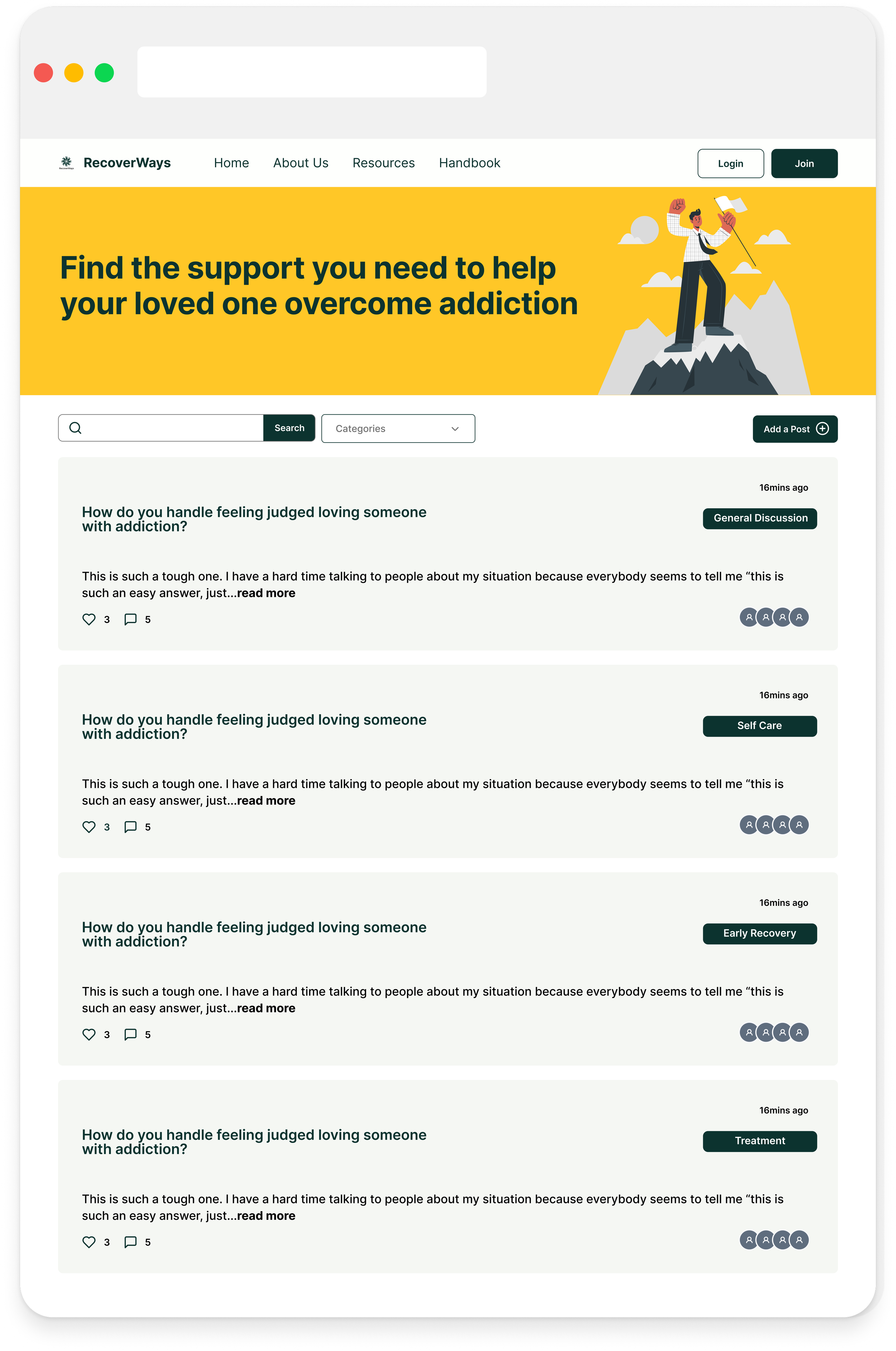
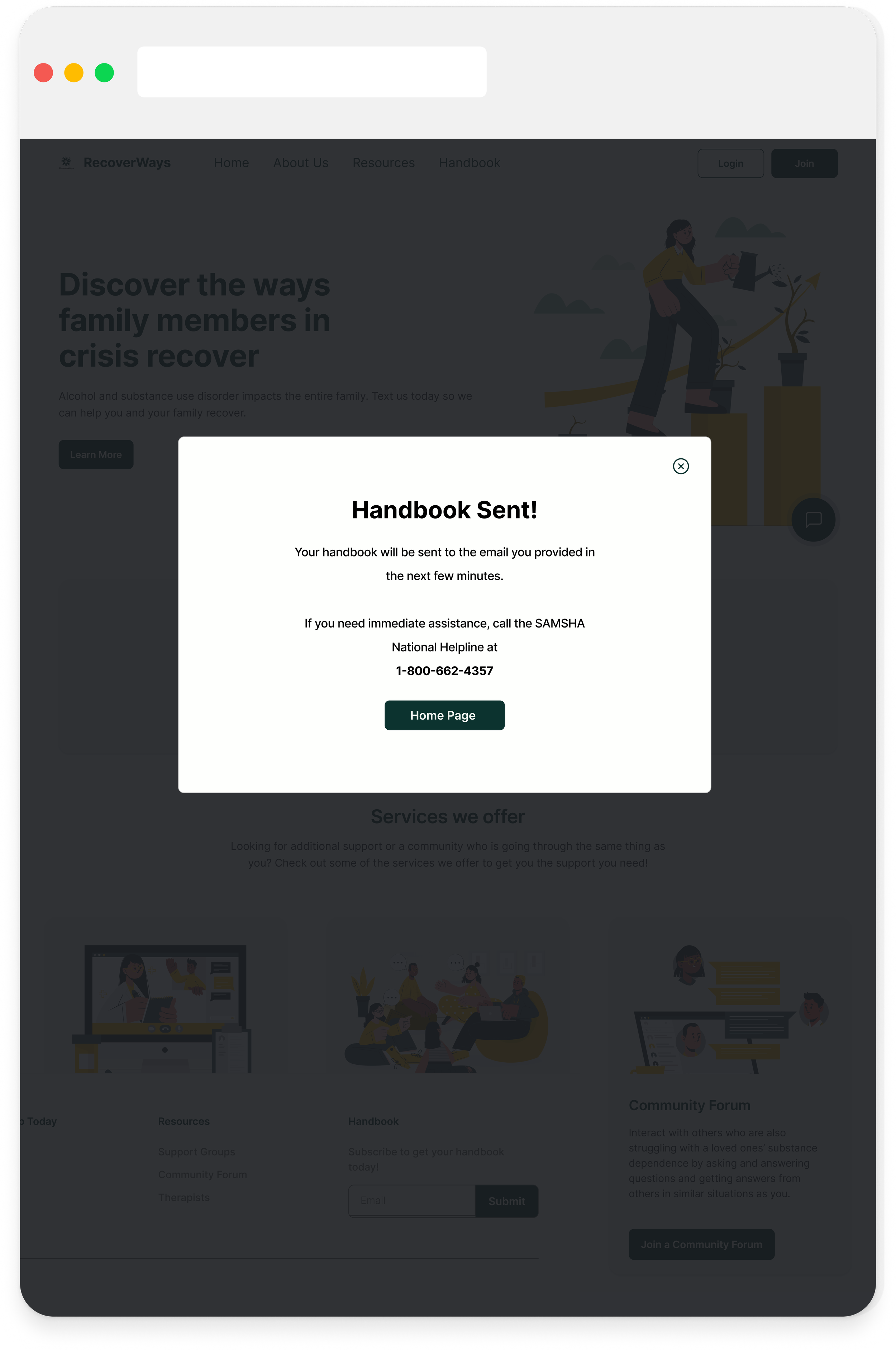
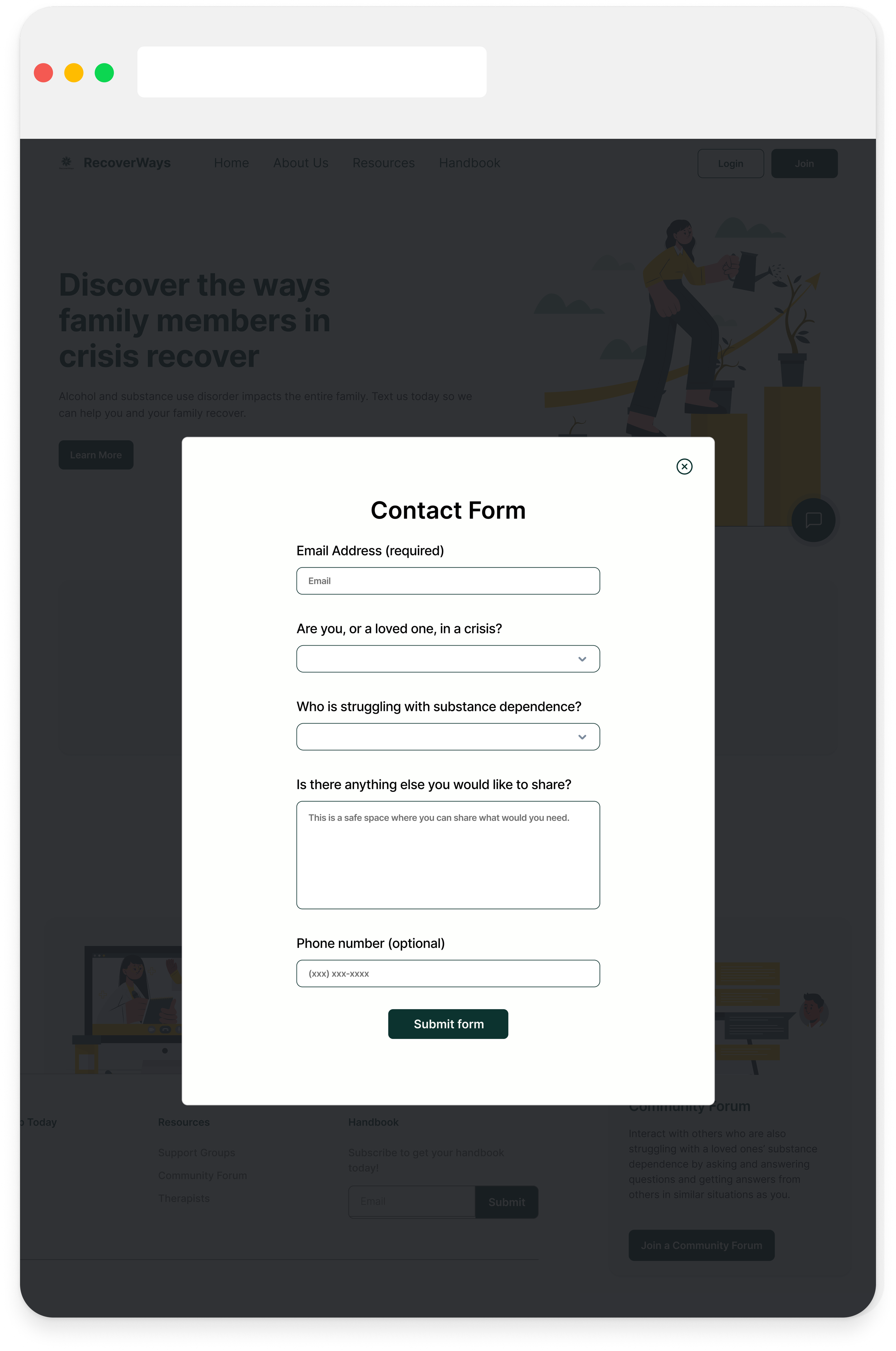
Using the newly updated and reorganized design system, I began to design the final hi-fidelity mockups. Iterating continued to happen during this process, along with regularly checking that our final fonts and colors met color contrast and accessiblity standards so users of all abilities can use RecoverWays.
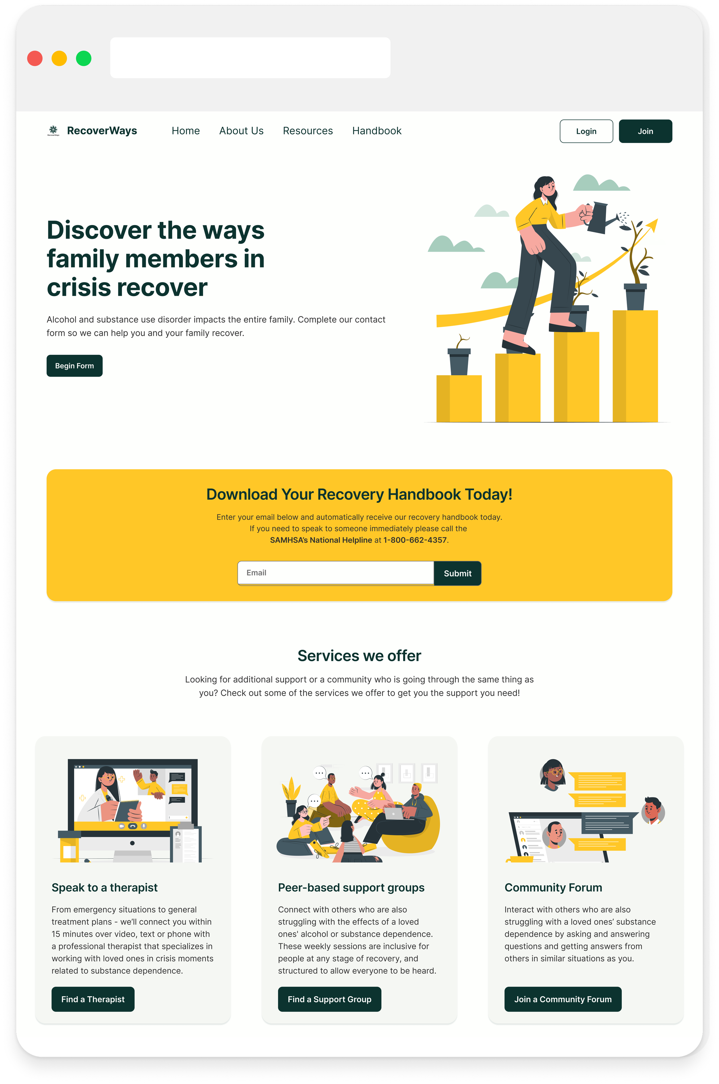
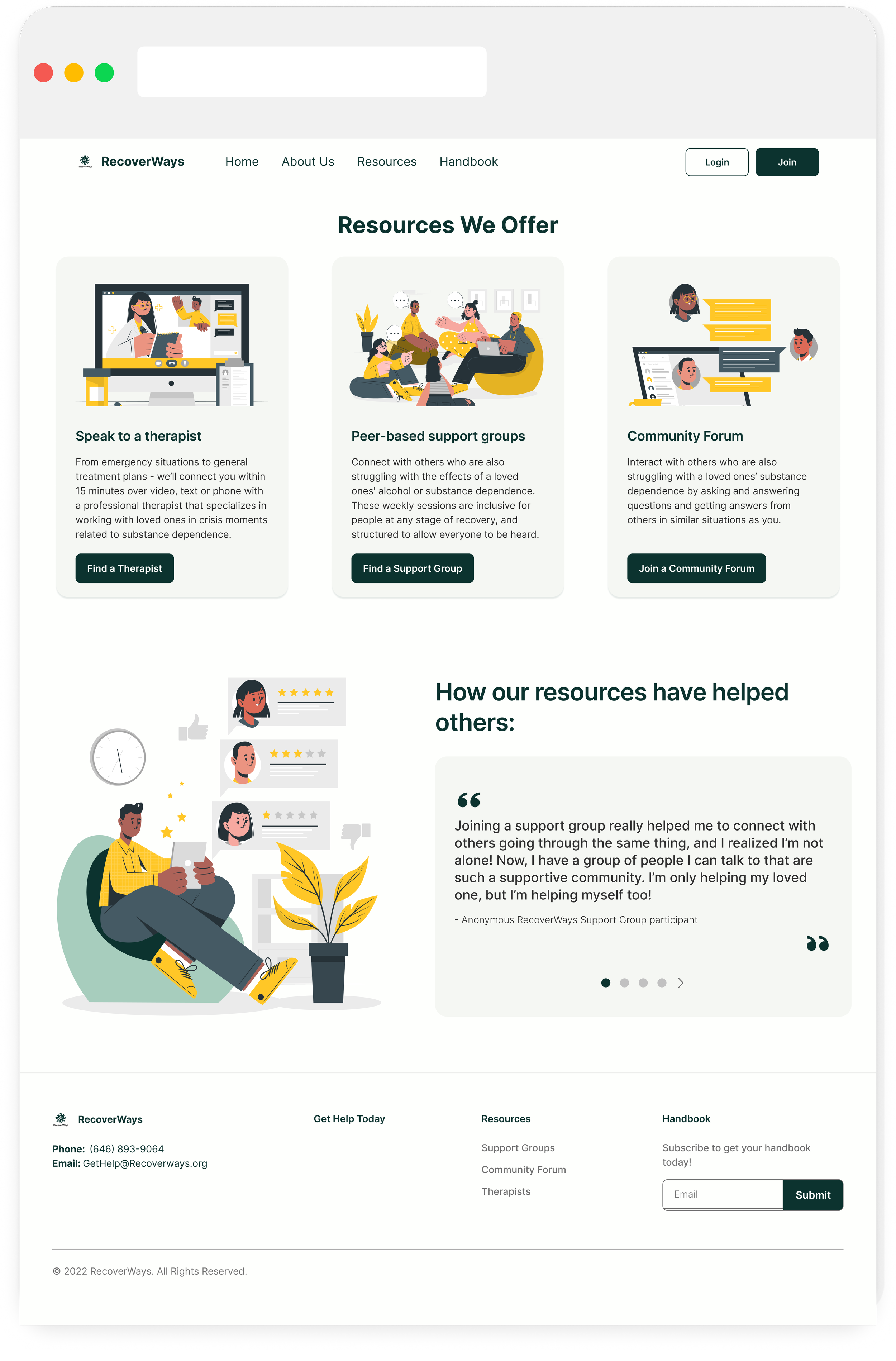
After multiple iterations, the final hi-fi mockups for the redesign were complete and met the goals of increasing the original websites accessibility, functionality, and creating a visual design that was welcoming and felt safe for users!
Developer Handoff
Developer Handoff
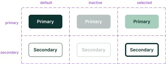
Once the hi-fi mockups were complete, I prepared for developer handoff by providing measurements and annotations to communicate interactions and aspects of the screen designs. My focus was on preparing the dev handoff for the support groups user flow, as well as completing dev handoff for the button state components. This also allowed future teams to understand our designs and decisions for a more seamless prototyping and usability testing transition.
Reflection & Next Steps
Reflection
Having a Positive Impact
This product was so rewarding to work on when I thought of our end users and how this website could help improve or save the lives of those impacted by addiction. Since I led the resource and support group pages, I got to have a direct impact on what the resources might look like and how best to support users in accessing them. I also really enjoyed getting to tap into my mental health background and leveraging that experience. I would love to continue to work on products that have a positive, deep impact!
Design Systems to the rescue
At the start of this project, RecoverWays didn’t have an existing design system, creating a challenge of being consistent across the platform and slowed down the design process initially . As I began to build a design system, I also saw our team’s communication and consistency increase, and our decision-making became more efficient. With the design system in place, we were able to resolve consistency issues and focus more energy on other aspects of the design that would have a deeper impact!
UI/Visual Design is becoming a strength!
I've always considered my strength to be in UX and research as someone with a background in psychology and education. However, I found a new passion for UI and was energized leading my team in our visual design after the client chose my UI iteration. It was fun getting to bring my empathy skills to a new level by thinking about how certain color combinations and images might elicit thoughts or feelings in a user. I also enjoyed rationalizing why specific styles and imagery were chosen and using all that to bring our wireframes to life and creating a design that reflected business, client, and user needs!
Next Steps
With the high-fidelity mockups complete and a design system started for RecoverWays redesign, next steps could include:
Building a prototype and completing usability testing
Expanding website features and designing the therapist search and hotline chat
Updating the design system as new components and elements are created
These next steps would allow RecoverWays to continue to expand and provide essential addiction resources that put the user first!
Thank you for learning about my design process with RecoverWays!
Interested in seeing more or getting in contact? Use the links below to check out my other projects or get in touch!
